From Street to Screen: Designing an Intuitive Food Truck Ordering Experience
Project Overview
The Problem
Some individuals often crave local food-truck meals. While certain food-truck ordering apps exclusively offer a pick-up option, others fail to meet the needs of users who require a delivery option. Currently, there is a shortage of apps that allow users to order local street food online.
The Goal
The Foodruck app enables users to order local food-truck meals online, providing a convenient option for those who prefer enjoying these meals at home. Users can effortlessly order and pick up their favorite dishes from the food vendor of their choice.
Timeframe
3 weeks
Responsibilities
Research, User Flow, Persona Mapping, Competitive Analysis, User Journey Map, Low-Fidelity Wireframes, High-Fidelity Mockups, Prototyping, Testing
TOOLS
Figma, Google Docs, Google Forms, Zoom
Empathize Phase
Research
To better understand the needs of the target users, I conducted interviews, which provided valuable insights into their challenges and expectations. One key user group that emerged from my research consists of busy working adults who struggle to find time to prepare their meals. Their feedback confirmed my initial assumptions about food truck customers—they seek a seamless, affordable online food ordering experience while ensuring confidence in food quality. However, a major pain point for them is the difficulty of finding the right food truck. My goal is to enhance the usability and overall user experience of the food truck delivery application, making the process more efficient and enjoyable.
Competitive Analysis
My audit goal is to compare the ordering a of food truck delivery apps available in the US.

Define Phase
Affinity Diagrams
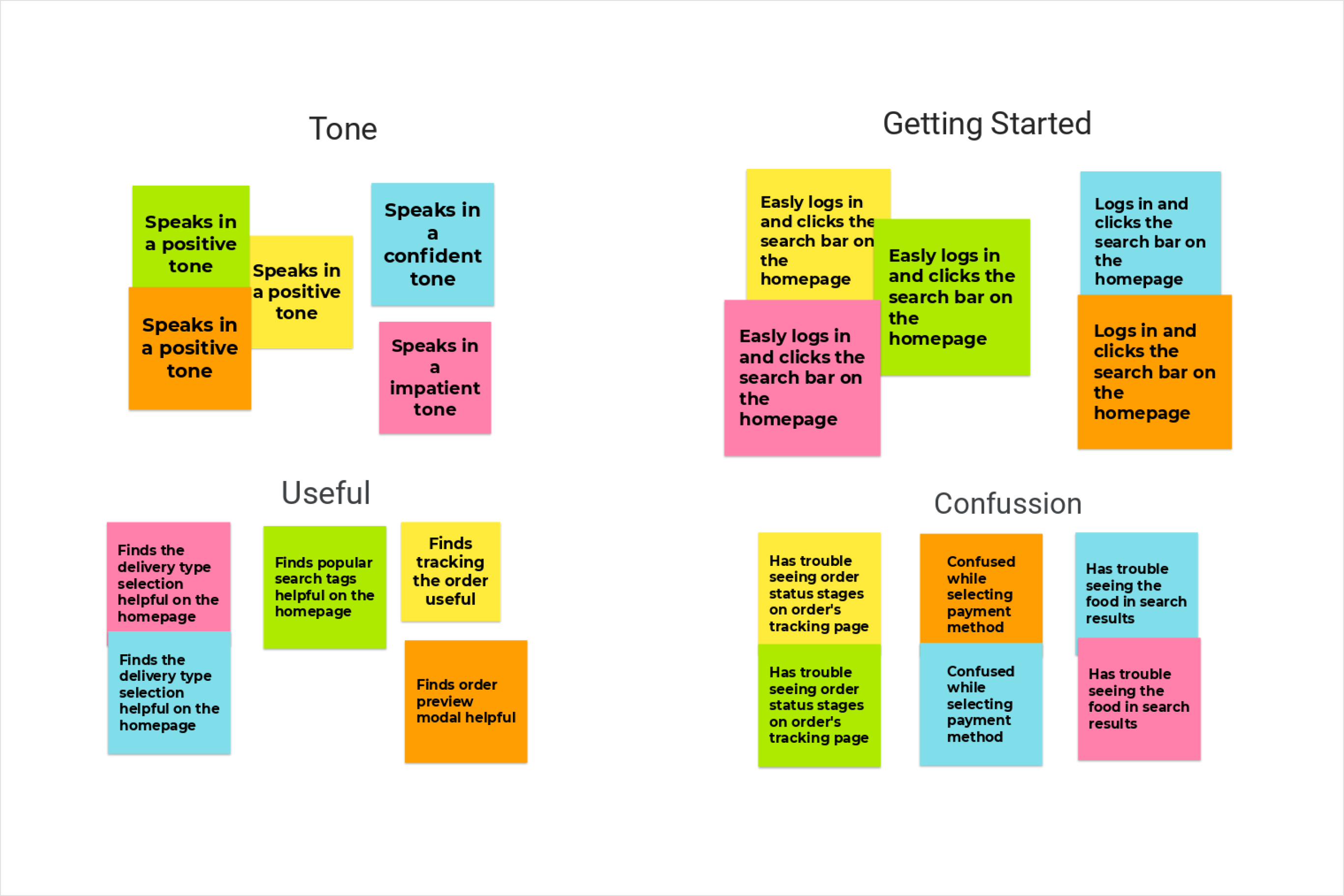
User Pain Point
Busy professionals often find it challenging to allocate time for cooking their meals, so they prefer to order take-out.
They would like to find out the current locations of the food trucks, eliminating the need to search for them.
Most platforms sometimes allow tracking the live locations of food trucks, but they don't offer detailed order tracking.
User Personas


Ideation Phase
User Journey Map

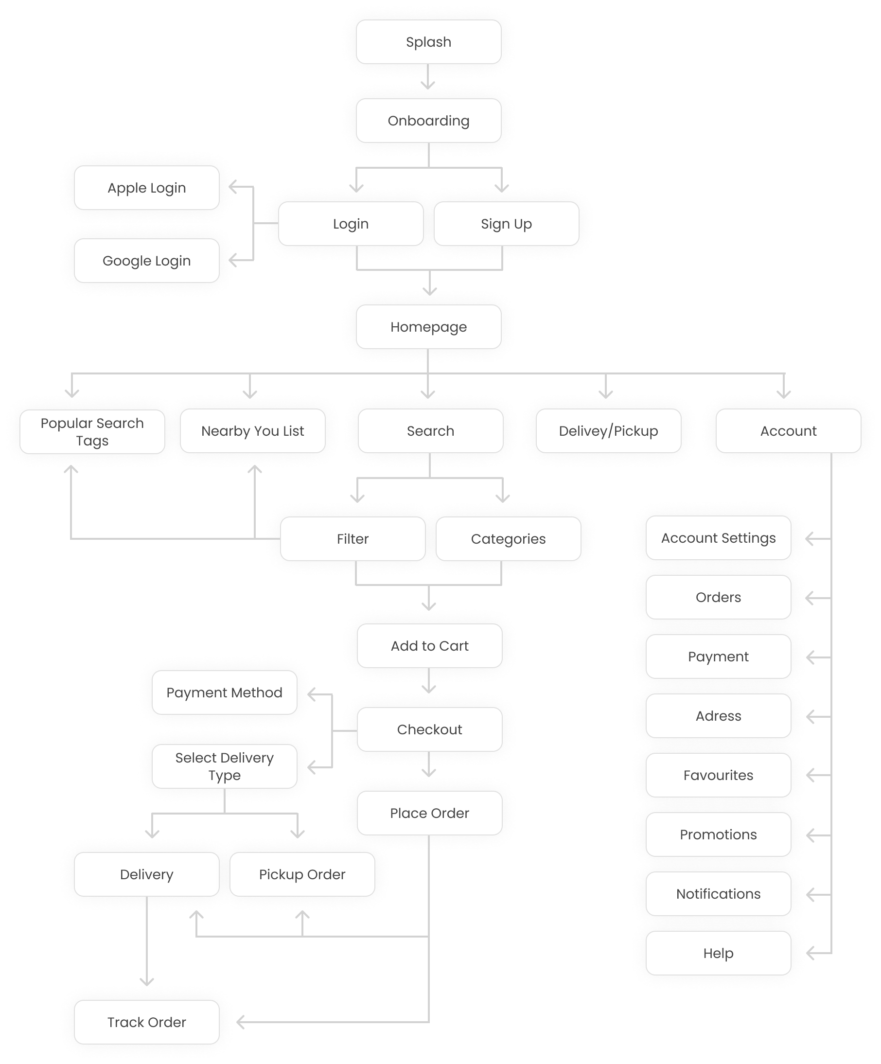
User Flow
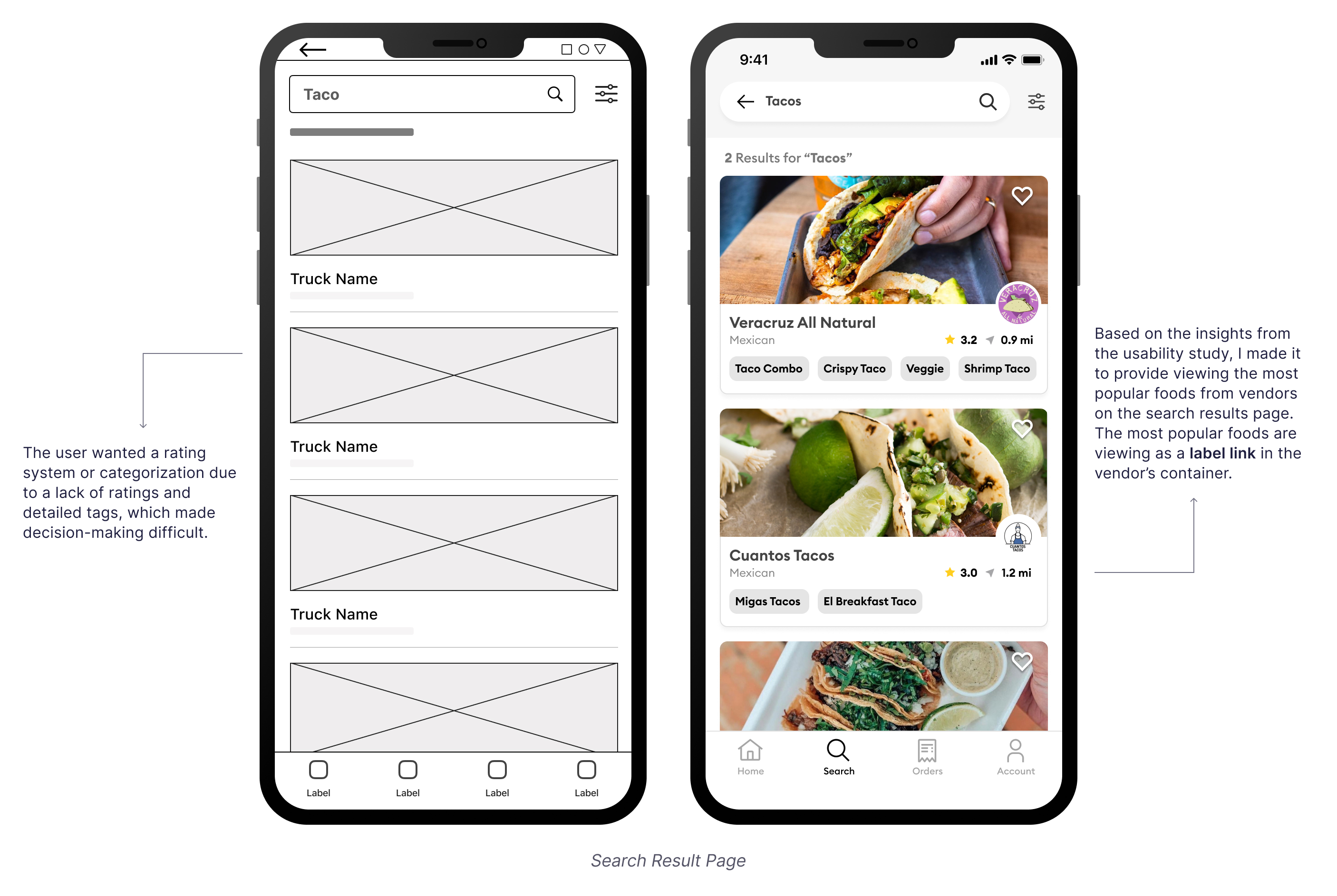
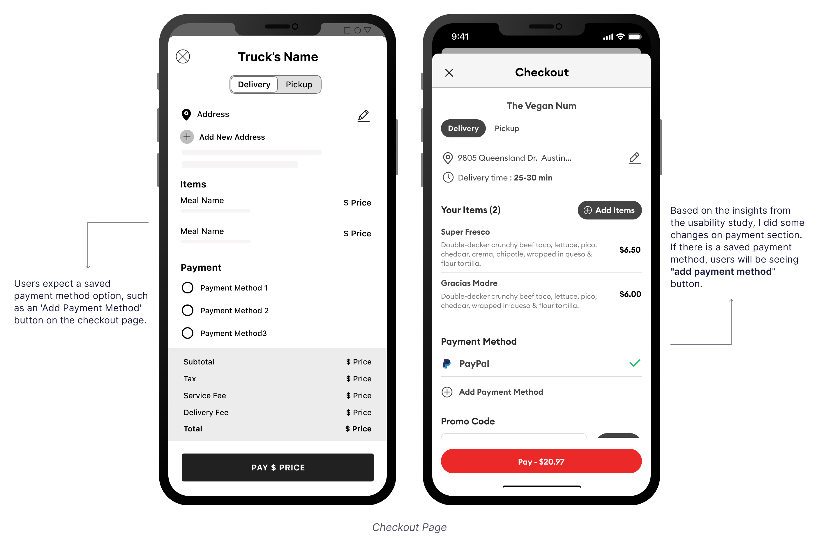
Low Fidelity Wireframes
After ideating and drafting some paper wireframes, I created the initial designs for the project. These designs focus on users who might search for the project name after being inspired by something and browse the details.


Test Phase
Usability Testing
I conducted an unmoderated usability study with 5 participants. Research goals are determining if users can complete core tasks and making sure the user flow is correct if the app has any pain points in the whole process of the task flow.
Round 1 Findings
- Users wanted to see foods and food trucks in search results.
- Users wanted to click payment button without adding the payment option.
- Users wanted to see the order's status stages on the order's tracking page.
Round 2 Findings
- Users wanted to see the most popular foods at vendors on the search results page.
- If there is a saved payment method, users wanted to see “add payment method” button.
- Users wanted to go to the orders page after placing an order.
Refining The Visual Design
Design System
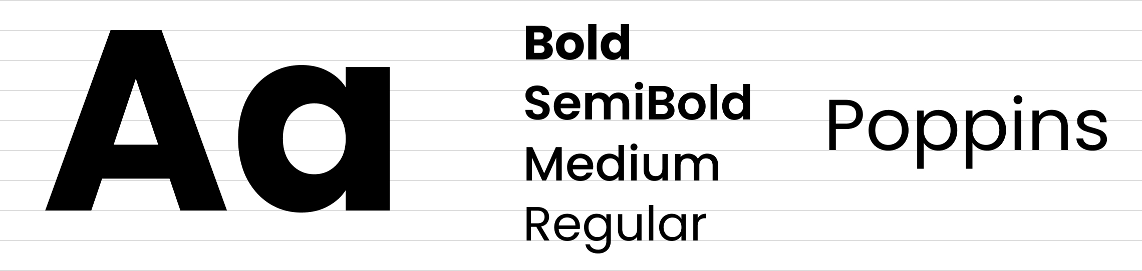
I created a clean, cohesive system using Poppins for clarity and a bold color palette of grays, red, and green for contrast and energy. Reusable components ensure consistency, while carefully selected icons enhance usability. Prioritizing accessibility, I refined contrast, spacing, and text sizing for an intuitive, seamless experience.
Typography
Colors

Icons
Components

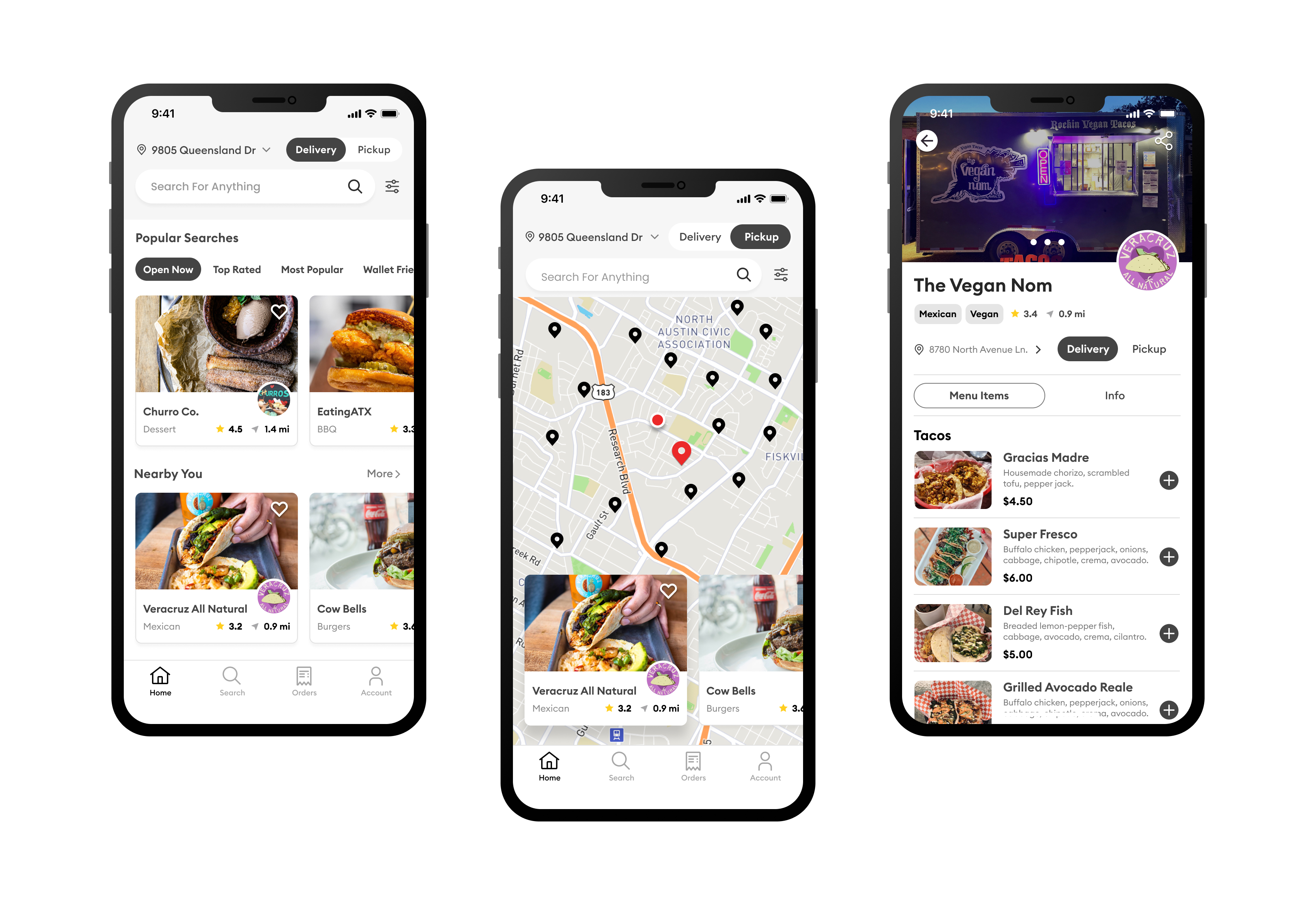
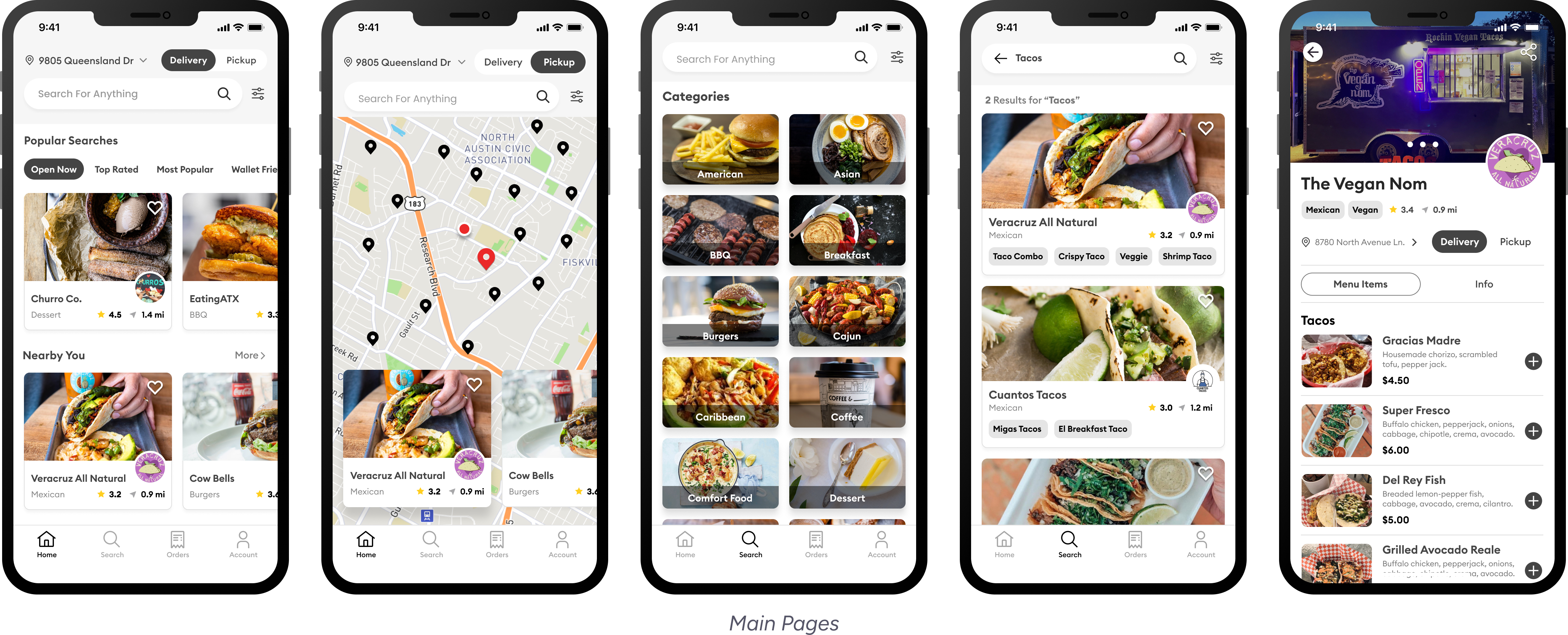
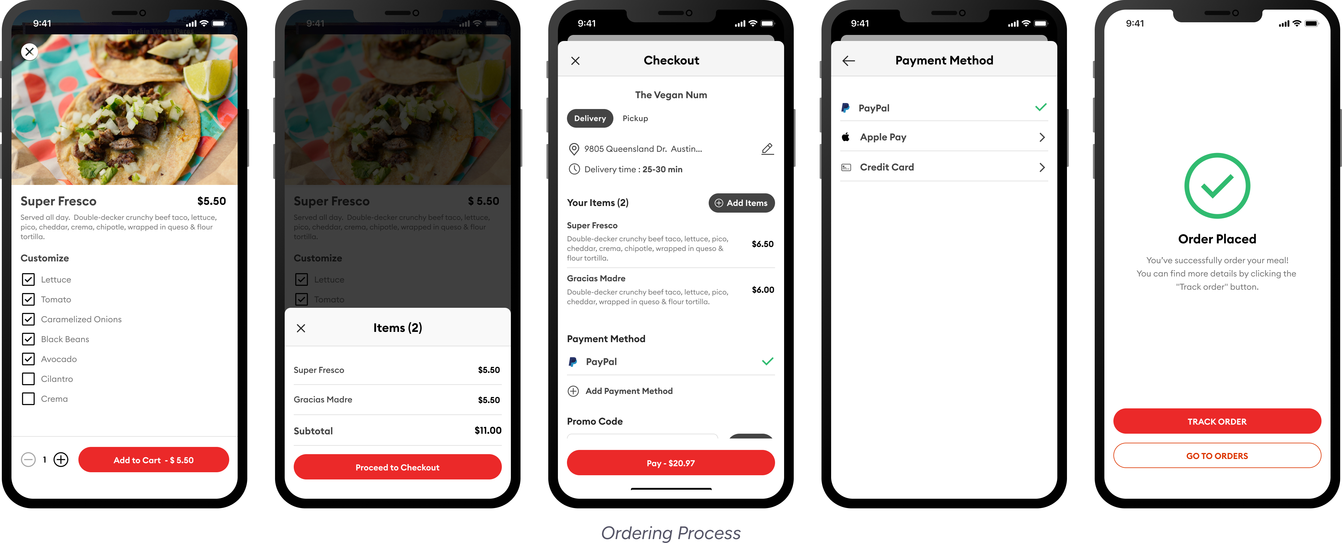
High Fidelity Mockups
For this project, I designed 34 high-fidelity mockups to bring the app’s interface to life. I focused on details like typography, color schemes, and interactive elements to create a polished yet intuitive experience.
Accessibility Considerations
The app follows WCAG guidelines, maintaining sufficient color contrast for readability.
Buttons and interactive elements have ample touch targets, making the app easy to use for individuals with motor impairments.
The font choices prioritize legibility, with scalable text sizes and adaptable line spacing to enhance readability for all users.
Going Forward
Takeaways & Next Steps
Throughout the design process, this project reinforced the importance of user-centered design in the food industry, particularly for on-the-go customers seeking convenience and real-time updates. Key takeaways include the need for intuitive navigation, seamless ordering, and clear location tracking to enhance the overall user experience. Usability testing provided valuable insights, leading to refinements that improved accessibility and efficiency.
Moving forward, potential next steps involve expanding the app’s features, such as personalized recommendations, loyalty rewards, and integrations with social media for better engagement. Additionally, further testing with real users and food truck owners would help validate design decisions and uncover new opportunities for improvement.
High Fidelity Prototype
Other Projects