Wanderlog - Designing an Engaging Social Travel Diary to Discover, Plan, and Share Adventures
Project Overview
The Problem
Users want a simple, personalized way to capture and revisit their travels. They value tools that let them log memories, get tailored recommendations, and share experiences with friends—without feeling cluttered or complicated. The ideal app feels intuitive, social, and uniquely theirs.
The Goal
The goal of this project is to create an intuitive, engaging app that helps users explore and track city destinations, share recommendations with friends , and document their experiences through personalized travel diaries with images and itenerary list.
Timeframe
4 weeks
Responsibilities
Research, User Flow, Persona Mapping, Competitive Analysis, User Journey Map, Low-Fidelity Wireframes, High-Fidelity Mockups, Prototyping, Testing
TOOLS
Figma, Google Docs, Google Forms, Zoom
Empathize Phase
Research
The goal of this research was to understand how travelers organize and share their travel experiences, their pain points, and what motivates them to keep a digital travel diary. To gain insights, I conducted a survey with 13 participants to collect quantitative data on travel documentation habits. 1:1 interviews with 5 frequent travelers to explore their needs, frustrations, and behaviors in more depth.
Key Questions of Survey
Define Phase
User Pain Point
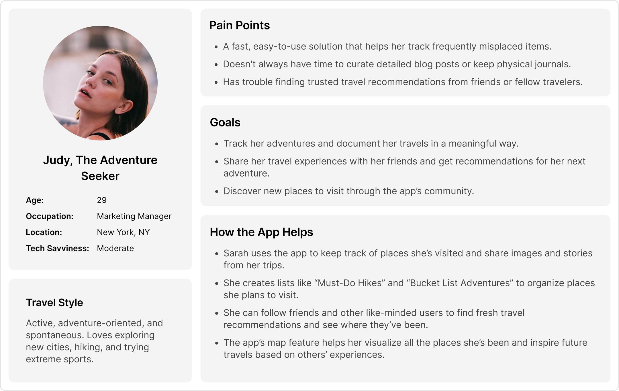
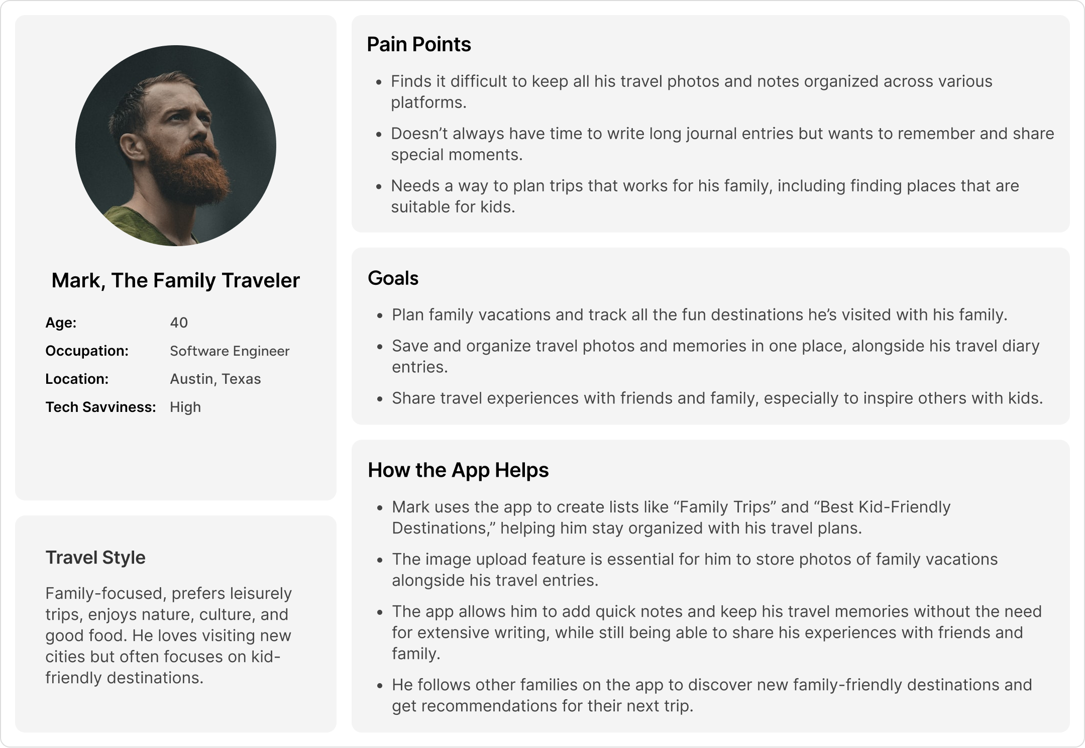
User Personas
To better understand user needs, I created user personas based on research and insights from surveys and interviews. This helped me design an experience that feels intuitive and valuable for real travelers.
Ideation Phase
User Journey Map
I mapped out the user journey to streamline trip planning, journaling, and sharing. Users discover places, save locations, and create lists before a trip. During travel, they log visits, add photos, and write diary entries. Afterward, they share highlights, tag friends, and revisit memories.

User Flow
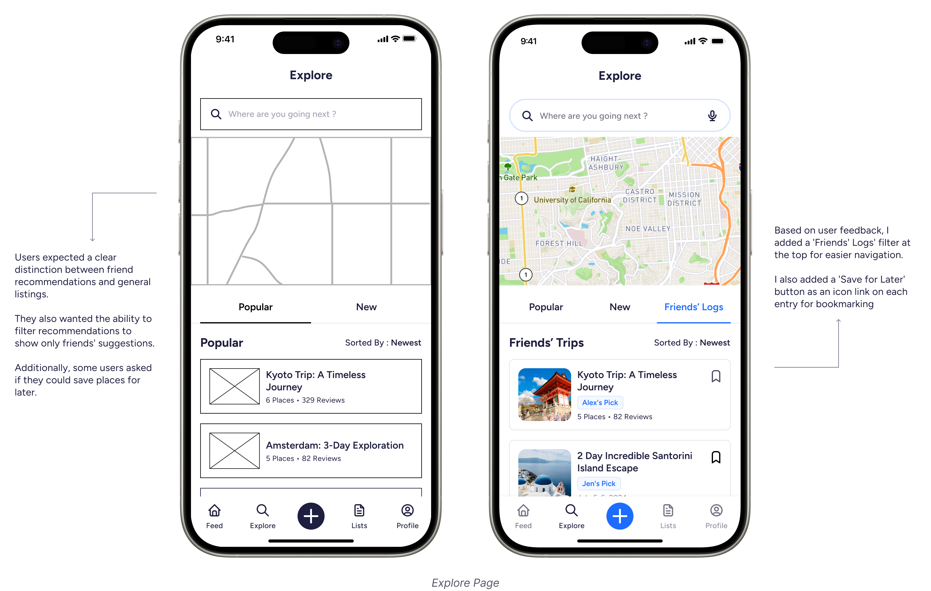
This app makes it easy to document trips, explore destinations, and connect with friends. Users start by signing up and selecting favorite destinations for a personalized experience. They can discover places through categories, trending spots, or a map view.
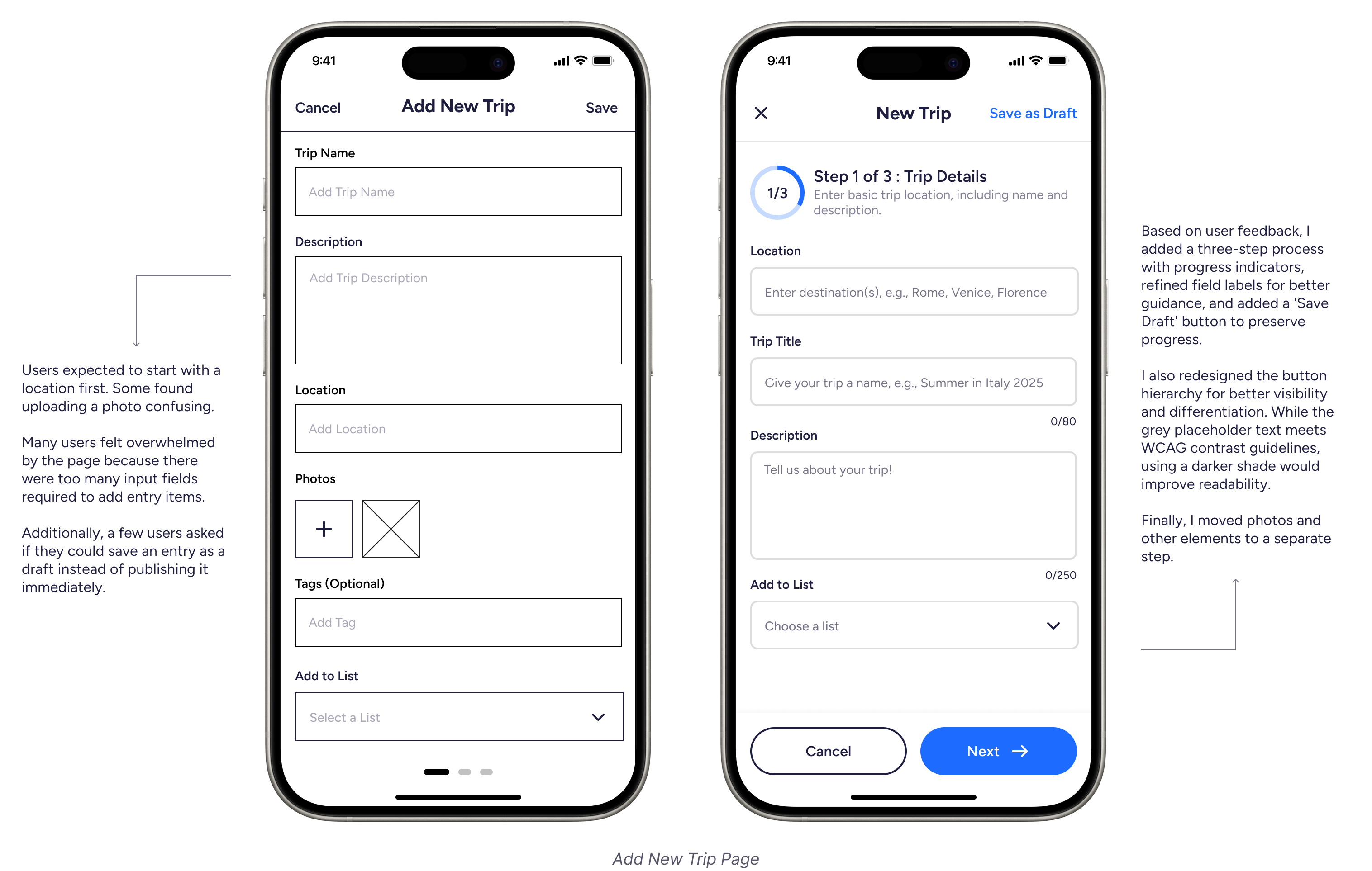
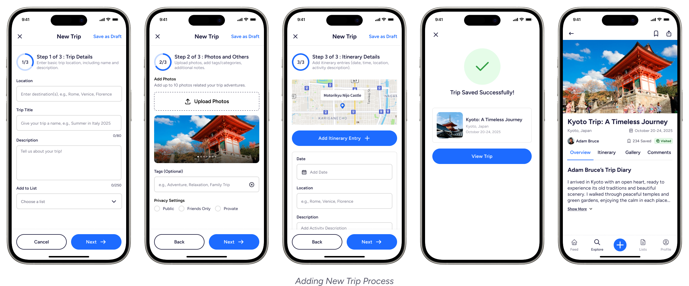
Adding a trip is simple—just enter a title, location, photos, and a diary entry and itenerary list. The feed shows friends’ posts and recommendations, while custom lists help organize must-visit spots. In the profile section, users can track their travels and update settings.

Design Phase
Low Fidelity Wireframes
Before working on the final designs, I created low-fidelity wireframes to plan the app’s layout and user flow. This helped me focus on the main screens, make navigation easy, and check that everything worked well before adding visual details.
Test Phase
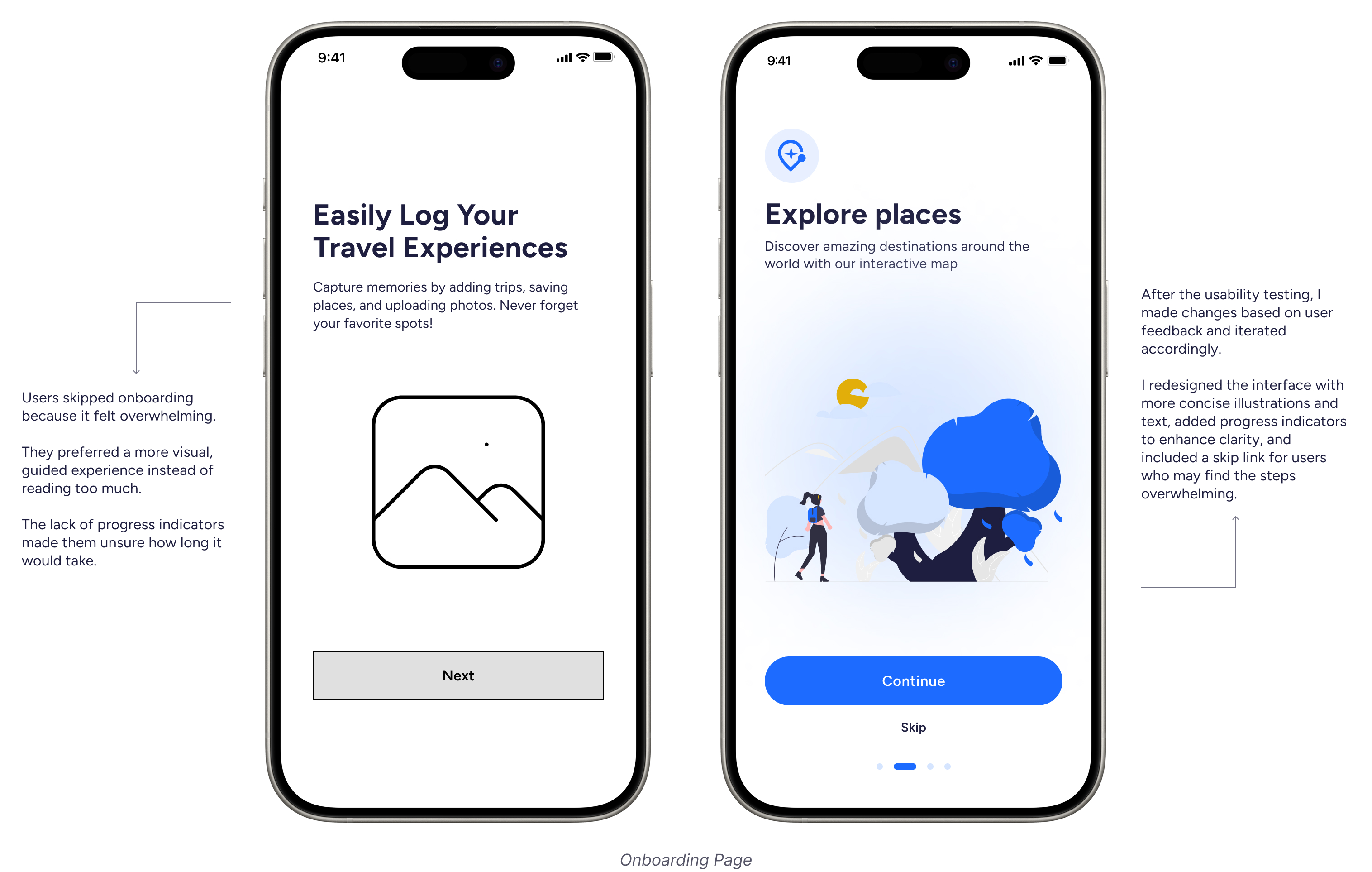
Usability Testing
I wanted to see how users interacted with the prototype—how easy it was to navigate, add travel entries, and explore recommendations. The goal was to spot any pain points and areas that could be improved before refining the design further.
Testing Method
- Participants: 5 users who travel frequently and use digital tools to document experiences.
- Testing Type: Moderated remote usability testing.
- Prototype Used: Figma interactive prototype.
- Task-Based Evaluation: Users were asked to complete three key tasks while thinking aloud.
Usability Findings
Refining The Visual Design
Design System
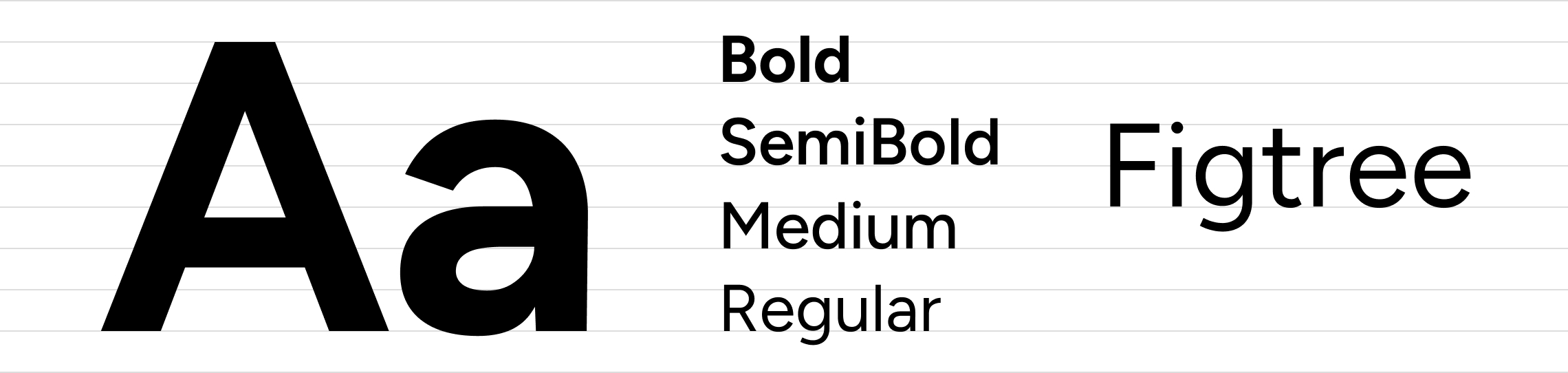
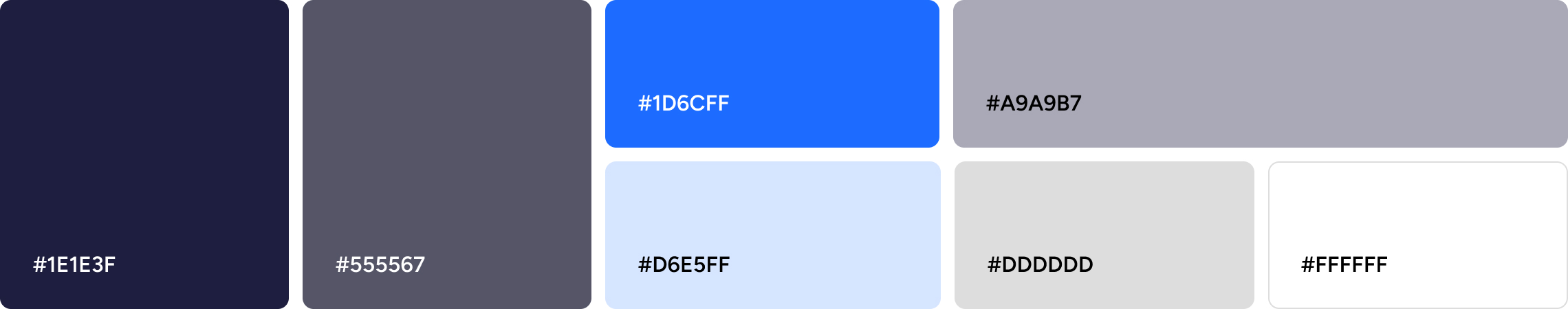
I created a design system for this project using the Figtree font in four weights to establish a clear hierarchy. Bold draws attention to headlines, SemiBold adds structure to subheadings, while Medium and Regular ensure readability. The color palette, centered around dark blue, bright blue, and neutral grays, provides clarity and balance. I also designed consistent icons and reusable components like navigation bars, trip cards, and buttons to maintain a cohesive look. Accessibility was a priority—I refined contrast, text sizing, and spacing to enhance readability. My goal was to craft a system that feels intuitive, approachable, and visually harmonious.
Typography
Colors
Icons
Components
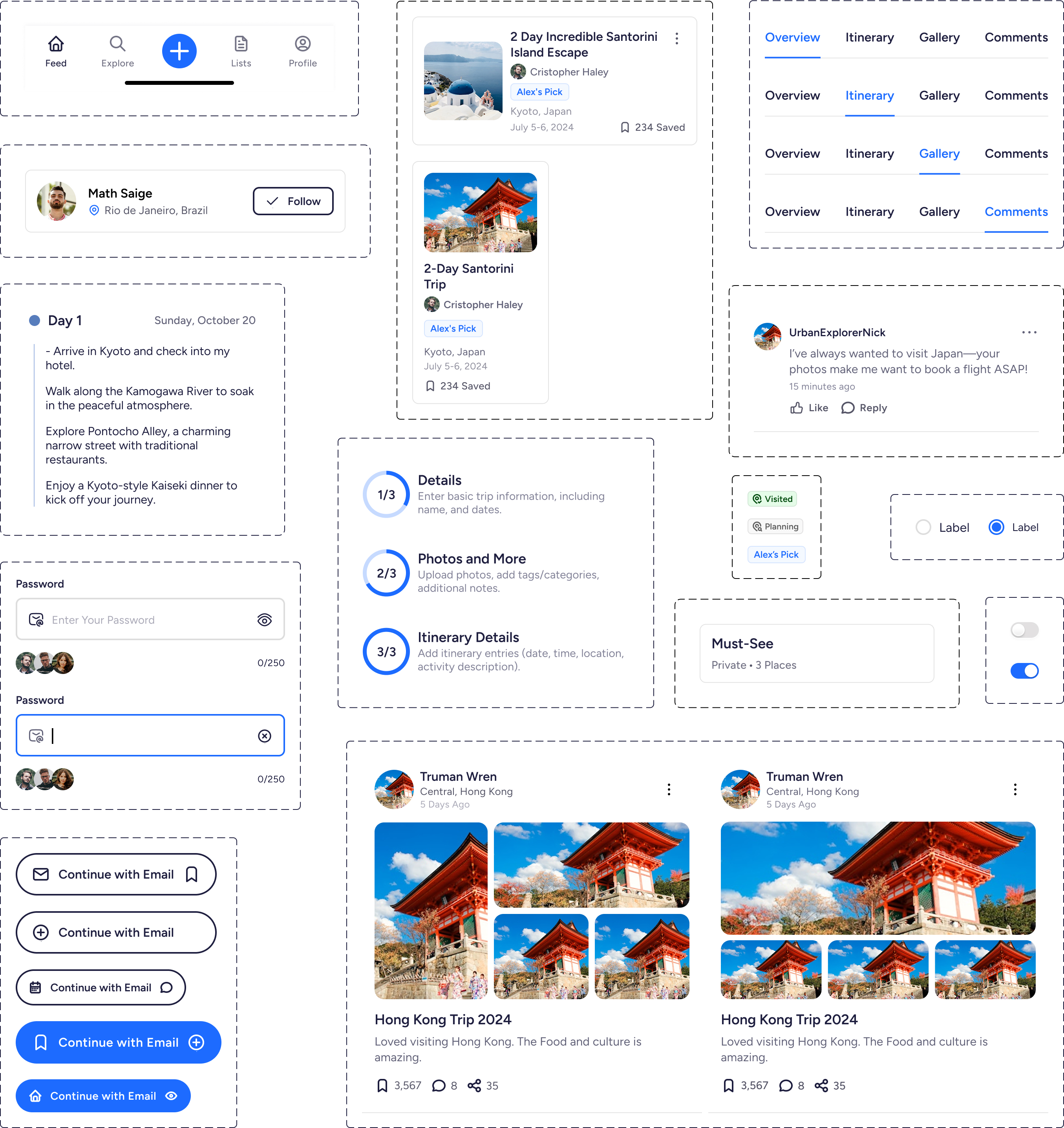
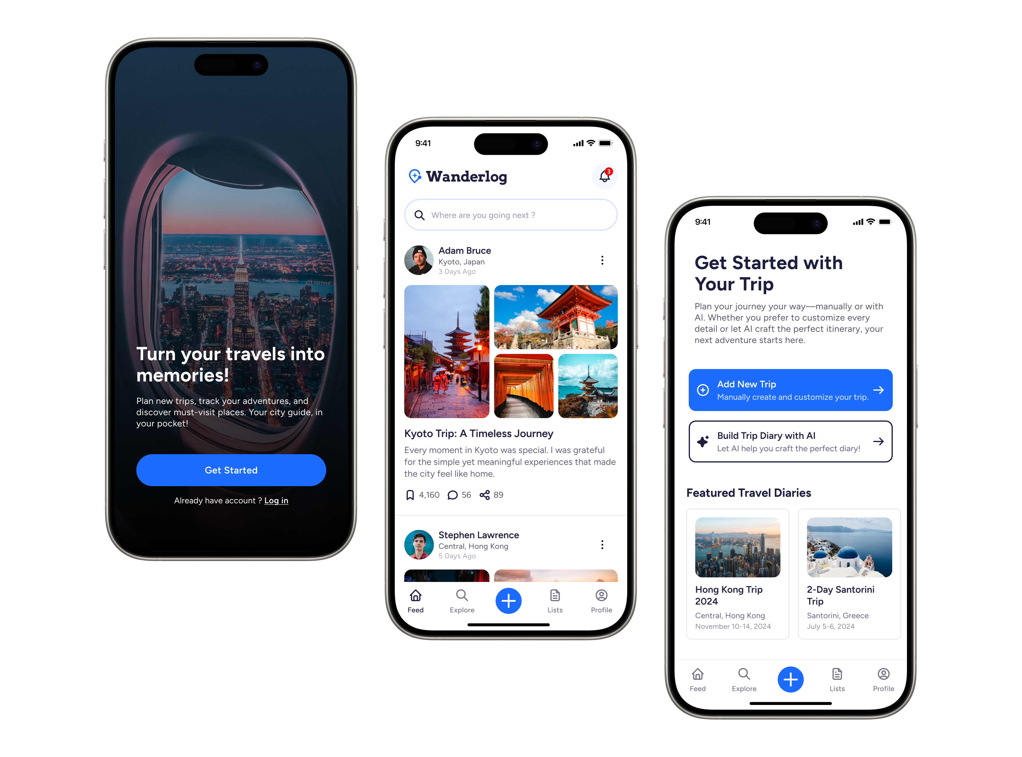
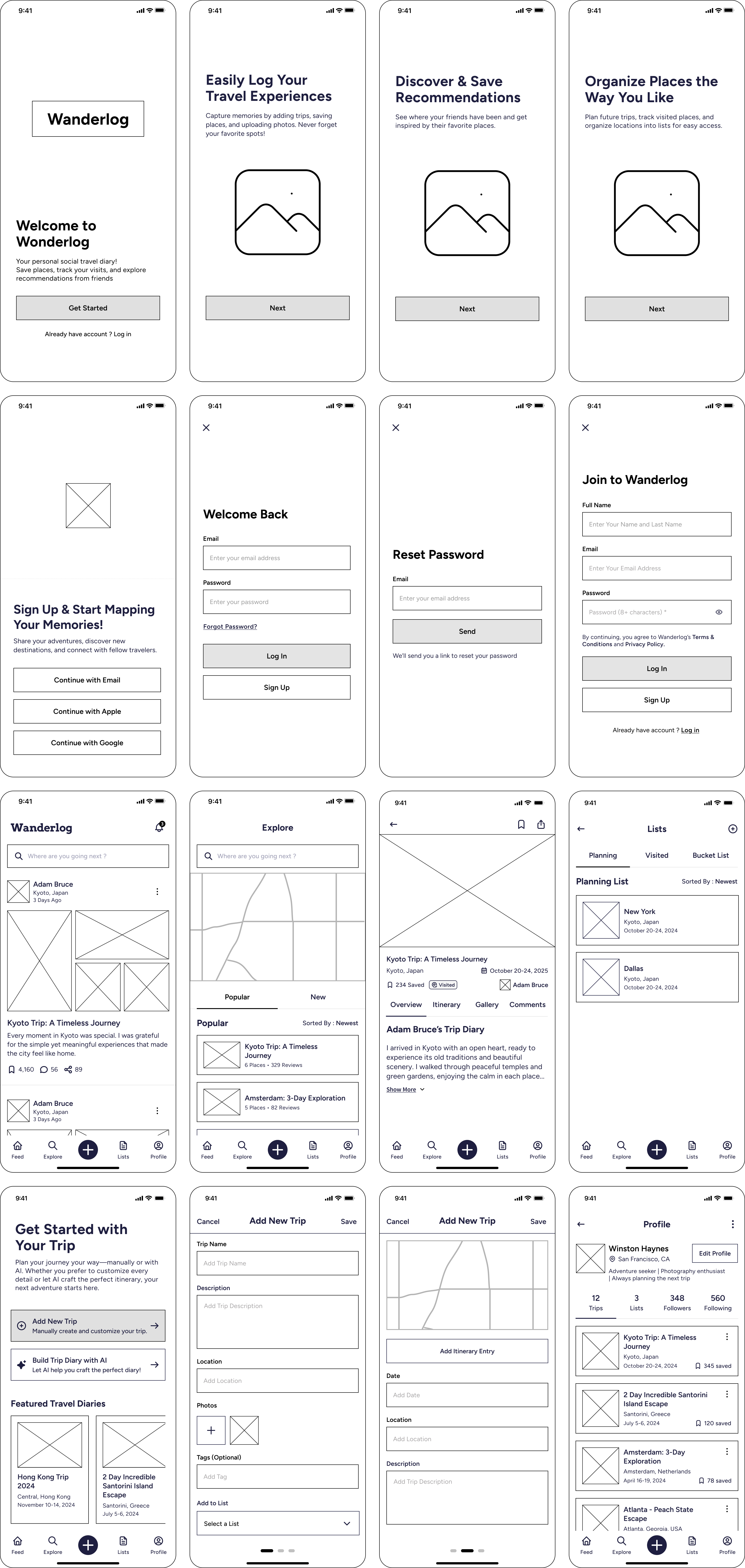
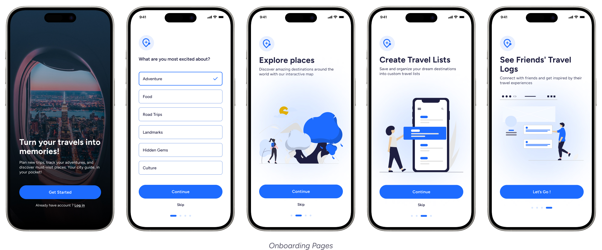
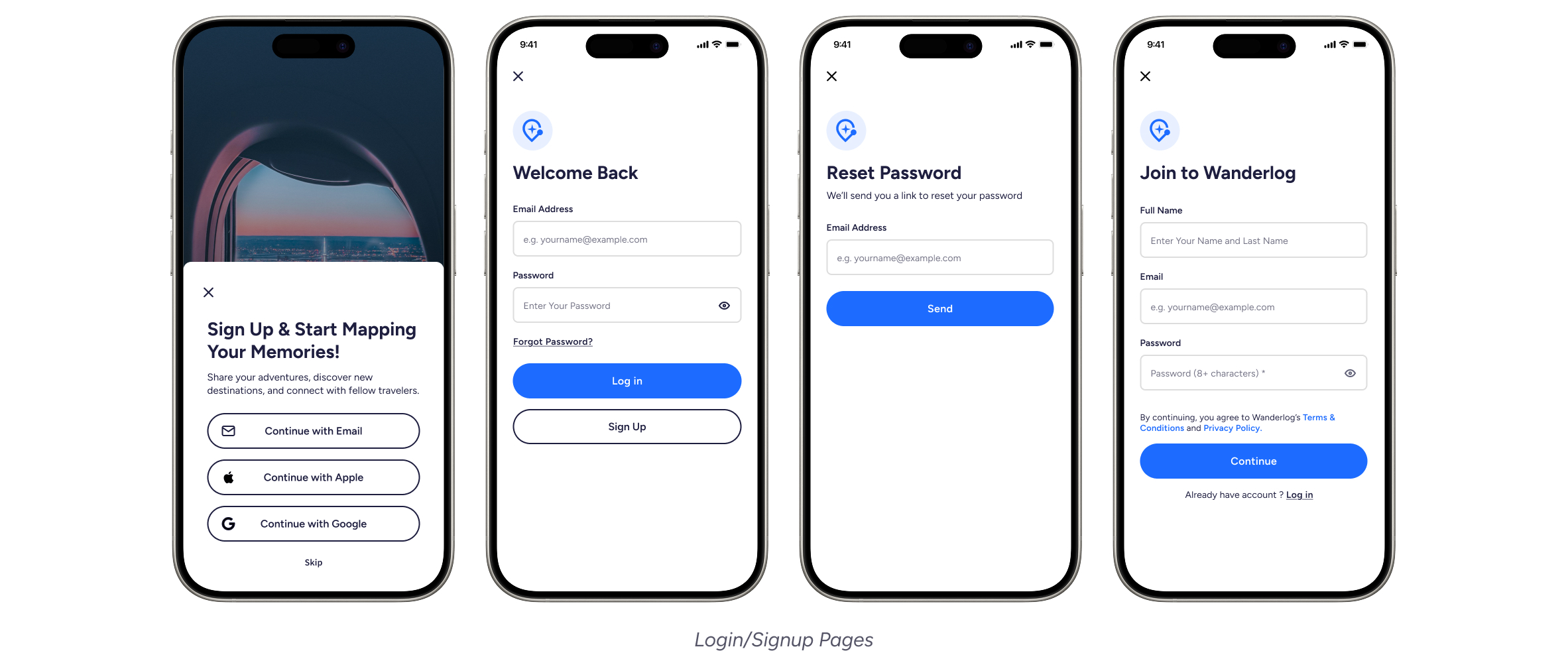
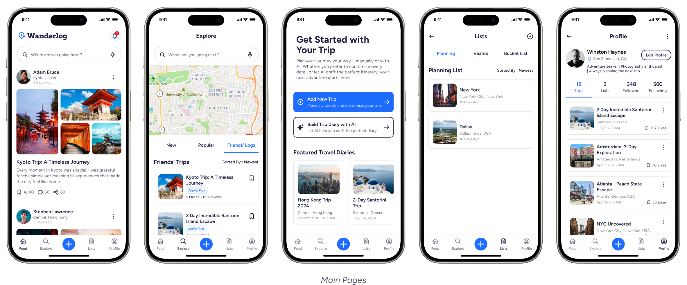
High Fidelity Mockups
For this project, I designed 42 high-fidelity mockups to bring the app’s interface to life. I focused on details like typography, color schemes, and interactive elements to create a polished yet intuitive experience. There are some essential screens below.
Accessibility Considerations
The app follows WCAG guidelines, maintaining sufficient color contrast for readability.
Buttons and interactive elements have ample touch targets, making the app easy to use for individuals with motor impairments.
The font choices prioritize legibility, with scalable text sizes and adaptable line spacing to enhance readability for all users.
Going Forward
Takeaways & Next Steps
This project taught me a lot about designing for different types of travelers and making sure the experience feels intuitive. I learned how small details—like clear navigation, social features, and accessibility—can make a big difference.
Next, I’d love to refine the recommendation system, improve the onboarding experience, and explore ways to keep users engaged. I also plan to do more usability testing to fine-tune the design. There’s always room to improve, and I’m excited to keep iterating!
High Fidelity Prototype
Other Projects