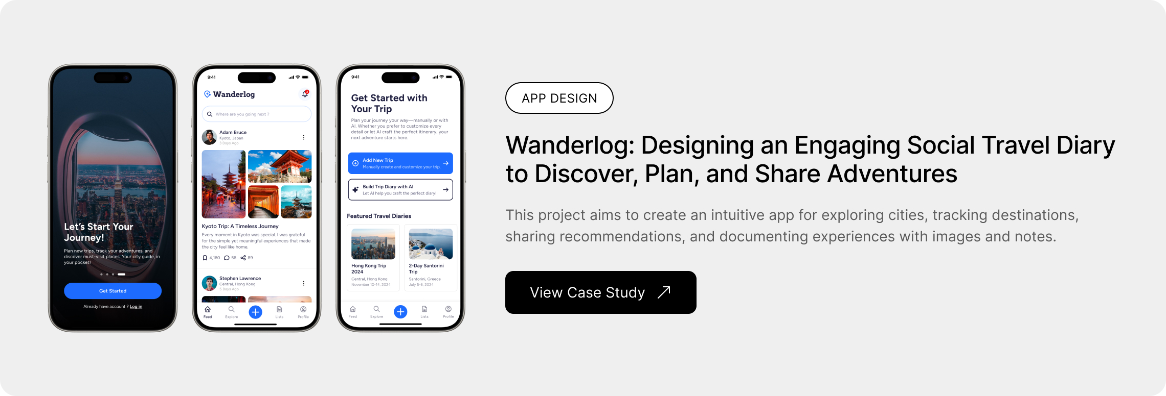
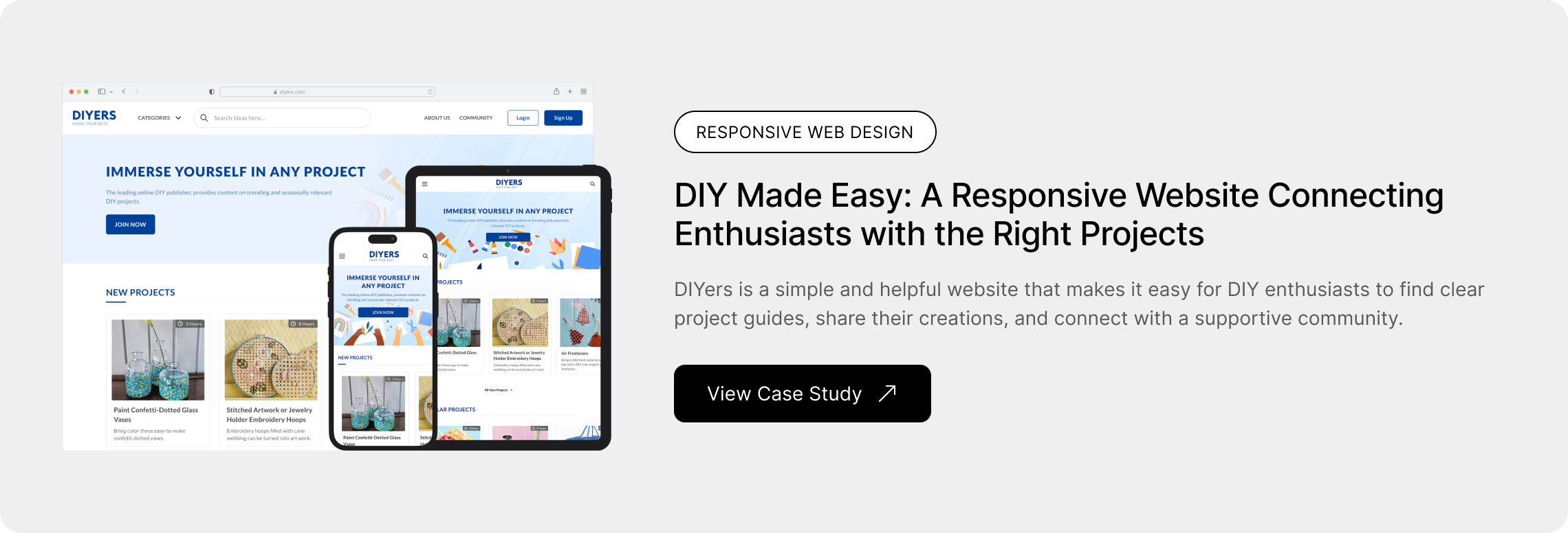
DIY Made Easy: A Responsive Website Connecting Enthusiasts with the Right Projects
Project Overview
The Problem
DIY enthusiasts often struggle to stay organized, find reliable guidance, and connect with like-minded creators. With inspiration, materials, and instructions scattered across multiple platforms, the process can feel overwhelming. DIYers need a simple, community-driven space to plan, learn, and share their projects with ease.
The Goal
Create a simple, inspiring platform where DIYers can easily plan projects, find reliable guidance, and connect with a supportive community.
Timeframe
4 weeks
Responsibilities
Research, User Flow, Persona Mapping, Competitive Analysis, User Journey Map, Low-Fidelity Wireframes, High-Fidelity Mockups, Prototyping, Testing
TOOLS
Figma, Google Docs, Google Forms, Zoom
Empathize Phase
Research
I conducted interviews and crafted empathy maps to gain insights into the users I am designing for and their needs. Through research, I identified a key user group: enthusiasts seeking tutorials to assist with their upcoming projects.
Users encountered difficulties while researching project ideas on multiple websites and faced challenges in finding the desired information. They struggled with decisions about the necessary tools and materials for their projects, resulting in decreased motivation before initiating the project, despite anticipating an enjoyable experience.
Competitive Analysis
My goal is to identify my key competitors and review the products of my competitors and find their gaps in this competitive audit.

Define Phase
User Pain Point
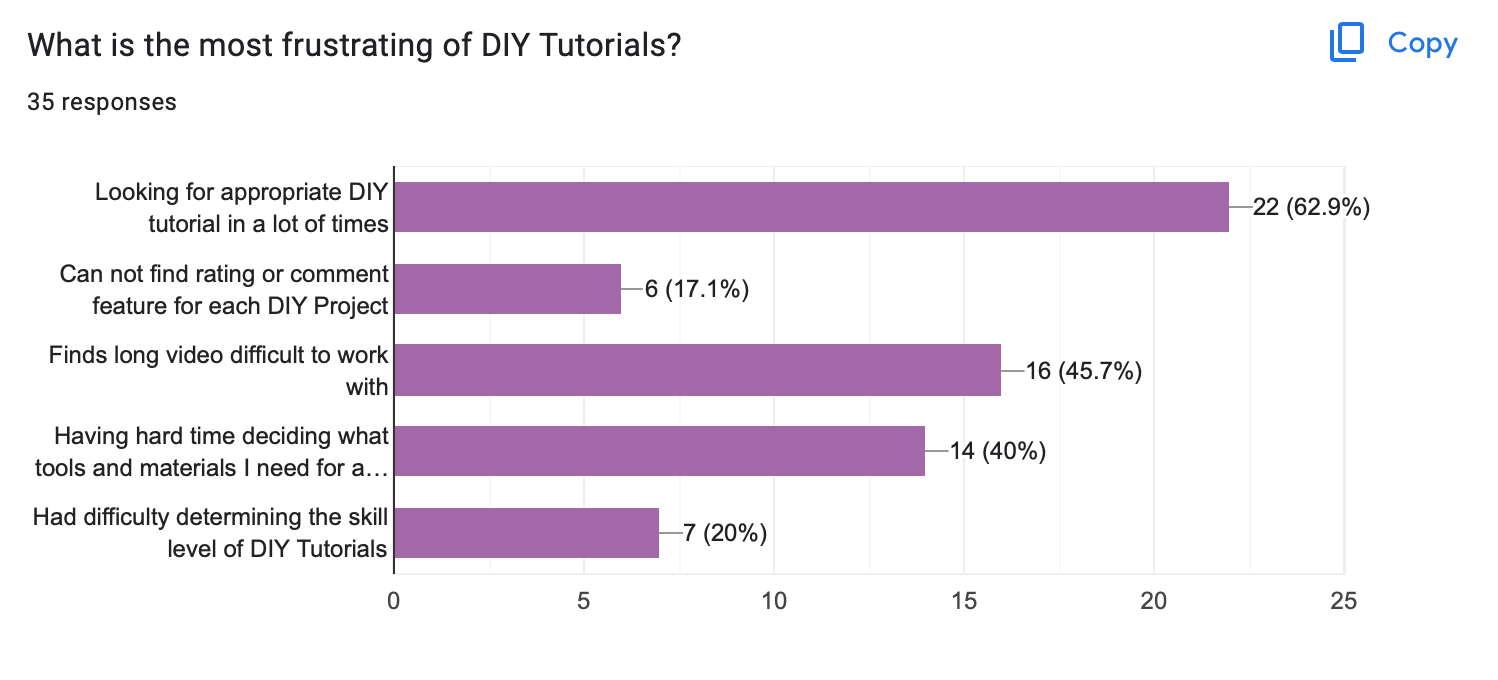
Finding clear and appropriate DIY tutorials in one place is challenging due to the varying quality and clarity of available resources.
Having to spend additional time and effort searching for extra resources to meet the high expectations set by the project is incredibly time-consuming and often challenging.
Determining the appropriate skill level and accurately estimating the time required for a project can be particularly challenging when relying on DIY tutorials due to their varying complexity and the potential for missing details.
Finding comprehensive and user-friendly tutorials in a single location, along with opportunities to learn through interaction with other users, can often be a challenging and time-consuming task.
User Personas
To better understand user needs, I created a user persona based on research and insights from surveys and interviews. This helped me design an experience that feels intuitive and valuable for real travelers.


Empathy Maps


Ideation Phase
User Journey Map

Site Map
The primary challenges included insufficient search capabilities and a lack of clear tutorials on DIY websites. Keeping these issues in mind, I designed the sitemap to address these concerns.

Design Phase
Paper Wireframes

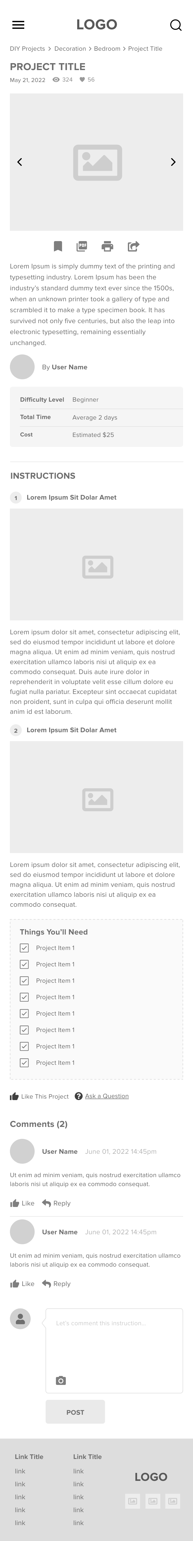
Low Fidelity Wireframes
After ideating and drafting some paper wireframes, I created the initial designs for the project. These designs focus on users who might search for the project name after being inspired by something and browse the details.


Responsive Variations


Test Phase
Usability Testing
I conducted an unmoderated usability study with 3 participants. Research goals are determining if users can complete core tasks and making sure the user flow is correct if the project has any pain points in the whole process of the task flow. These pain points below are items that users have determined.
Testing Method
- Participants: 3
- Testing Type: Moderated remote usability testing.
- Prototype Used: Figma interactive prototype.
Usability Findings
I moved the search bar from the hero section to the header section, so that users could access it easily.
Some users wanted to create a project easily so I put on the "create a post" button on the header section.
Some users wanted to see the total time of project info on the project content box.
Some users are frustrated about not searching feature on the forum page.
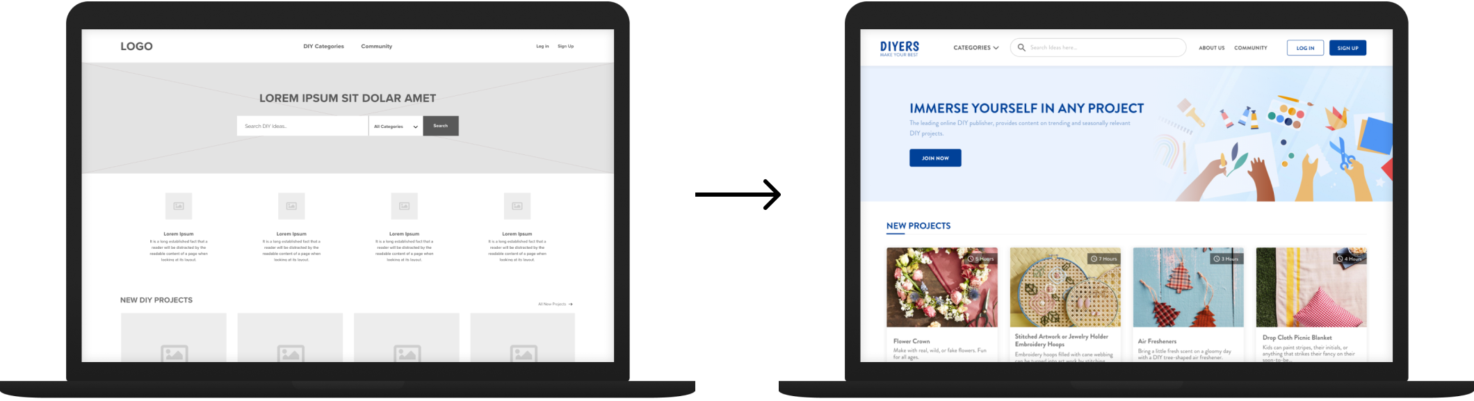
Based on the insights from the usability study, I moved the search bar from the hero section to the header section so that users could access it easily. I removed the content of the features section because some users found this section unnecessary.
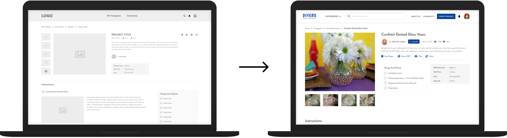
Based on the insights from the usability study, I moved the materials list near the project's stat section so that users could reach it easily.
Refining The Visual Design
Design System
The Design System for DIYers ensures a cohesive, user-friendly experience with a clean and modern aesthetic. It features the Lato typeface in various weights for readability, a balanced color palette of deep blue, purple, and neutral tones, and a versatile icon set for intuitive navigation. Reusable UI components, like navigation bars, buttons, and content cards, maintain consistency and accessibility, reinforcing the platform’s creative and collaborative spirit.
Typography

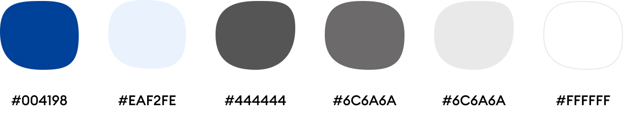
Colors
Icons
Components

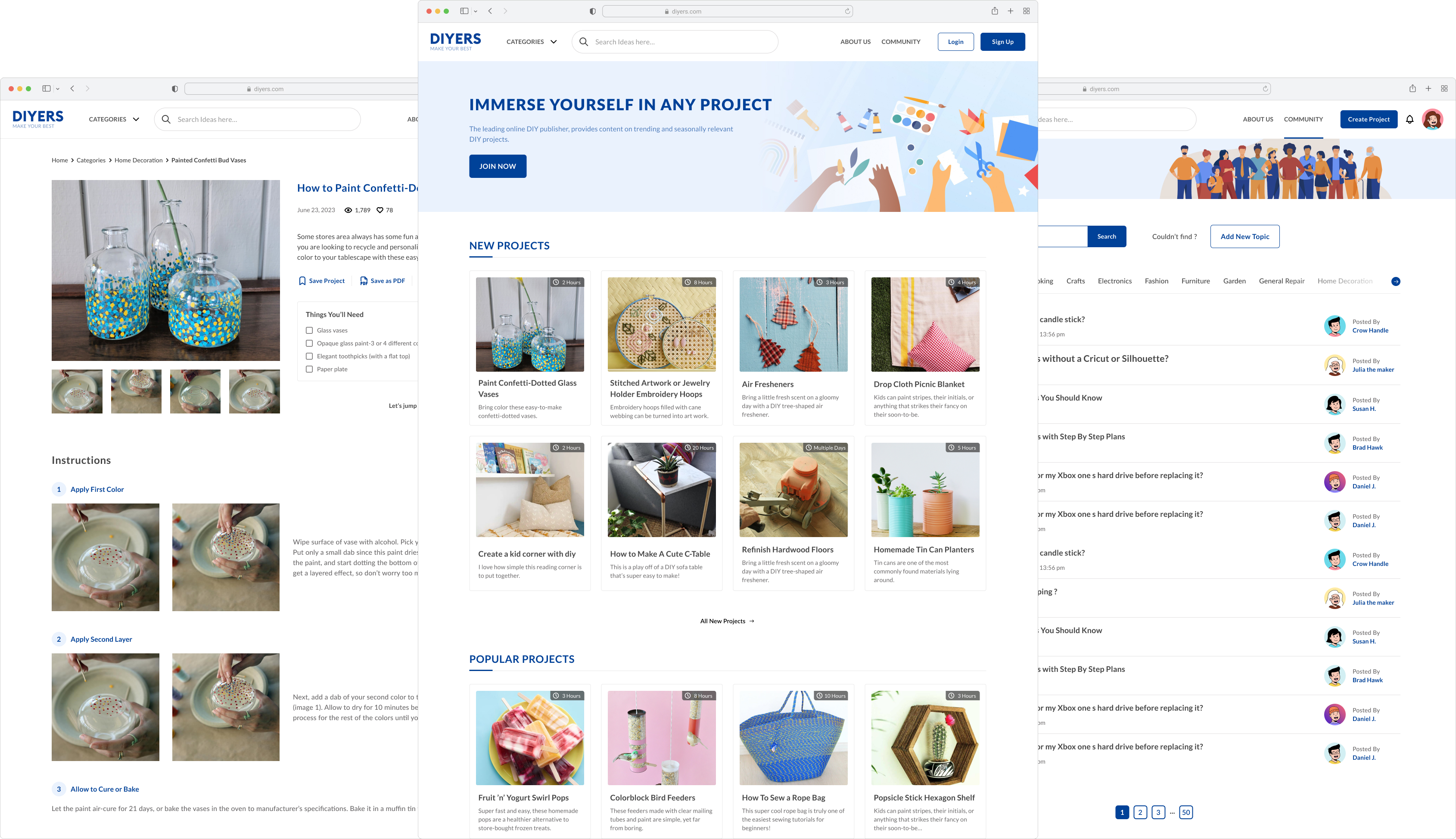
High Fidelity Mockups
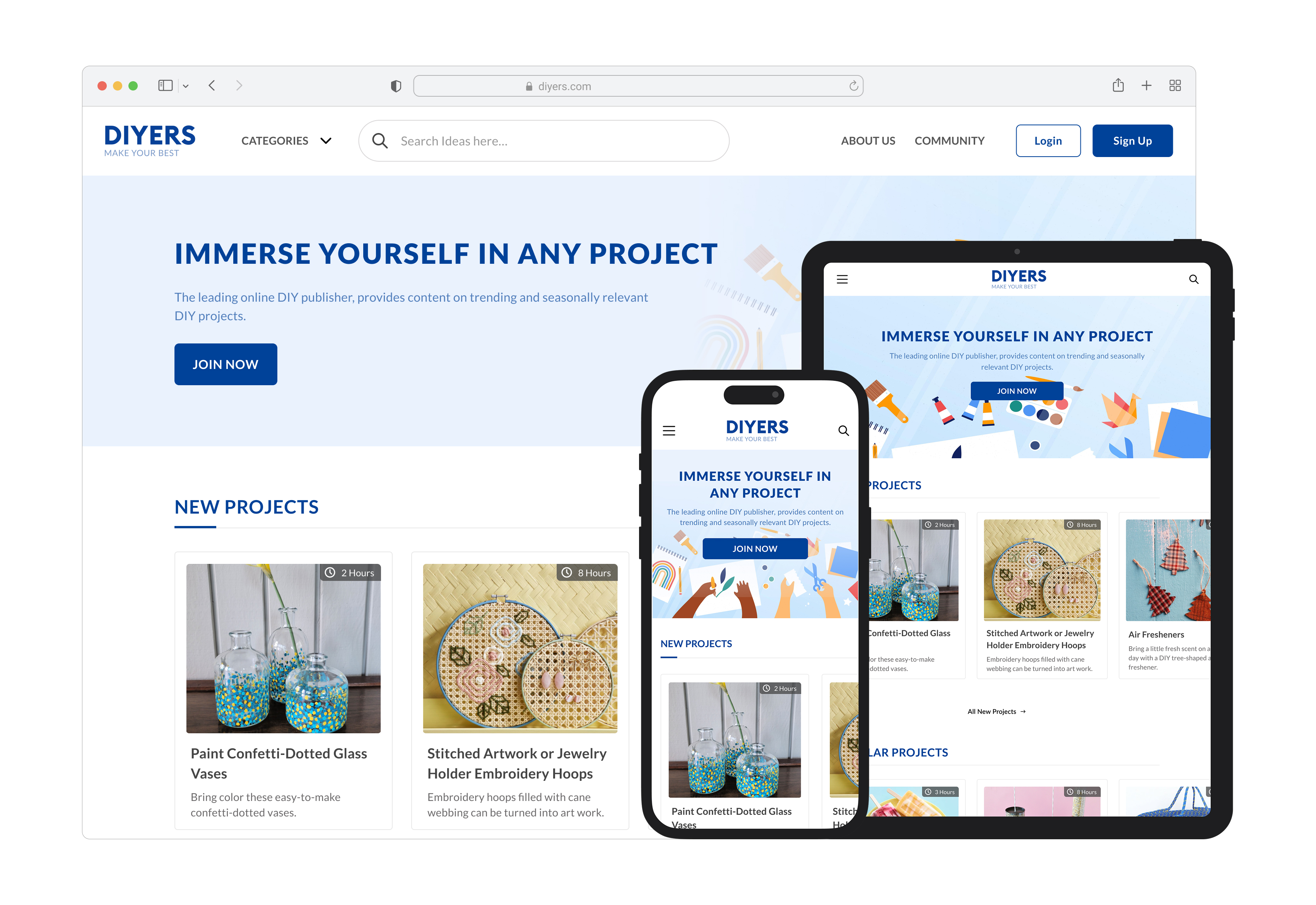
For this project, I designed 27 high-fidelity mockups to bring the app’s interface to life. I focused on details like typography, color schemes, and interactive elements to create a polished yet intuitive experience.
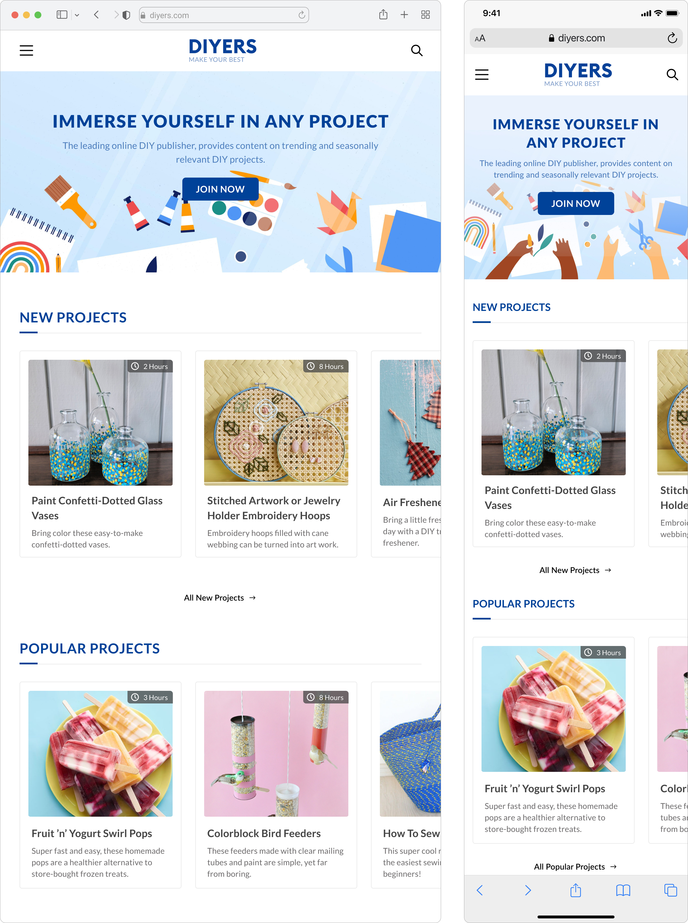
Responsive Variations
Accessibility Considerations
The app follows WCAG guidelines, maintaining sufficient color contrast for readability.
Integrated intuitive icons into the design to enhance navigation, making it more user-friendly and visually accessible.
The font choices prioritize legibility, with scalable text sizes and adaptable line spacing to enhance readability for all users.
Going Forward
Takeaways & Next Steps
Designing ParentBuddy reinforced the importance of empathetic and intuitive design for busy parents managing their child’s activities and milestones. User research highlighted the need for simplicity, efficiency, and collaboration, shaping a clean, functional UI.
Moving forward, the next steps include usability testing, feature enhancements like AI-powered suggestions and milestone insights, accessibility improvements, and refining the prototype for a potential MVP launch. This project reinforced my passion for human-centered design and the impact thoughtful UX can have on real-life challenges.
High Fidelity Prototype
Other Projects