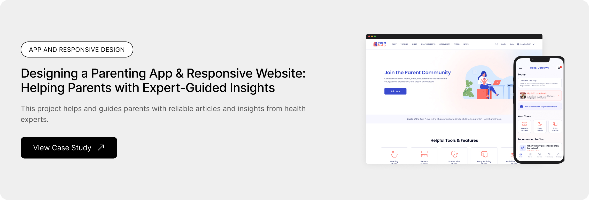
ParentBuddy - Designing a Parenting App & Responsive Website: Helping Parents with Expert-Guided Insights
Project Overview
The Problem
Parents encounter various challenges in raising children and fulfilling their role as caregivers. They seek to connect with health professionals for information and answers to their questions in various situations. Additionally, they desire a reliable platform for interacting with other parents of the same age at any given moment.
The Goal
The goal of this project is to assist parents in connecting with health professionals for support and guidance, while also facilitating community building by allowing users to connect with other parents through the app and responsive website.
Timeframe
4 weeks
Responsibilities
Research, User Flow, Persona Mapping, Competitive Analysis, User Journey Map, Low-Fidelity Wireframes, High-Fidelity Mockups, Prototyping, Testing
TOOLS
Figma, Google Docs, Google Forms, Zoom
Empathize Phase
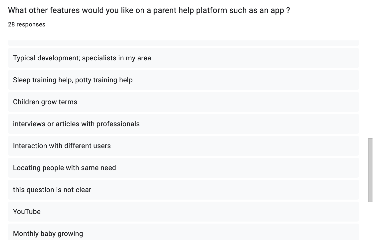
Research
I conducted a survey among parents to formulate interview questions. The majority of participants reported making efforts to comprehend the developmental stages of their children.
Many interviewers expressed difficulty in directly communicating with health professionals who do not necessitate a physical visit. They were unable to address their questions or concerns on a reliable platform.
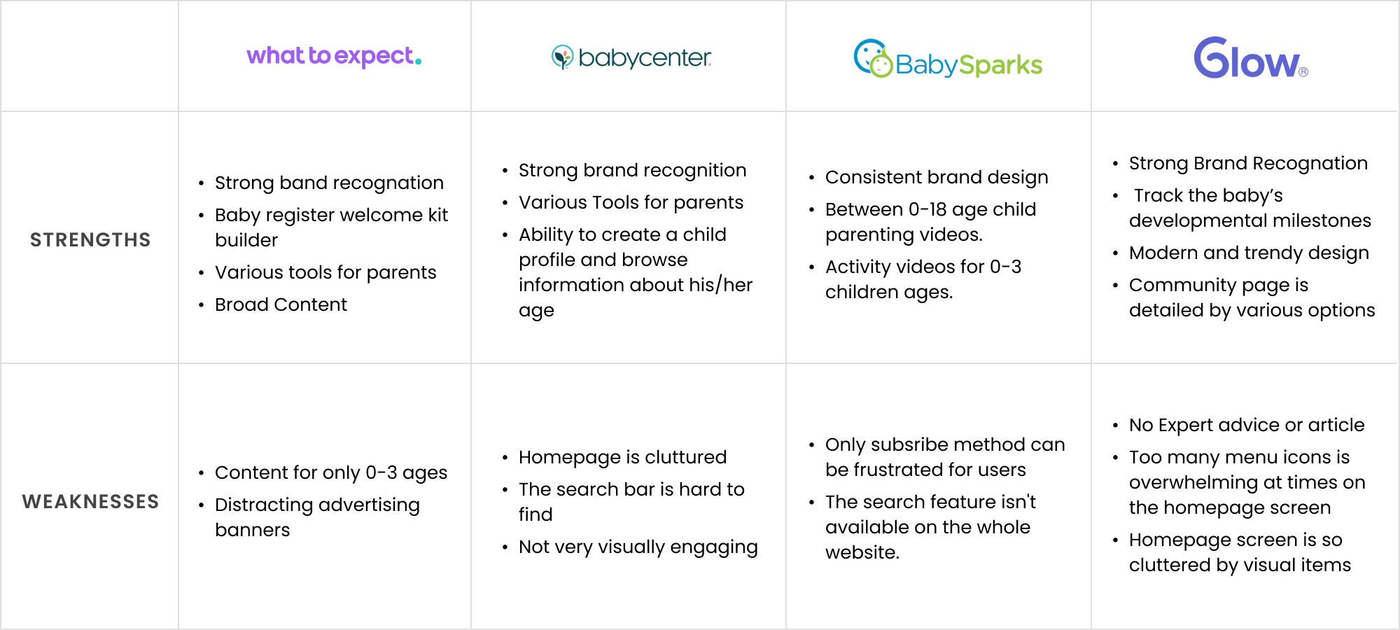
Competitive Analysis
My goal is to identify my key competitors and review the products of my competitors and find their gaps in this competitive audit.
Define Phase
User Pain Point
Parents are facing challenges in finding reliable and relevant information on parenting topics they are curious about.
We need a unified platform that gives people enough space to connect with health experts in different fields.
User Personas
To better understand user needs, I created a user persona based on research and insights from surveys and interviews. This helped me design an experience that feels intuitive and valuable for real travelers.


Ideation Phase
User Journey Map
I mapped the parenting resource journey to understand user struggles. Parents often feel confused when searching, overwhelmed when selecting, and uncertain when deciding what’s best. While implementing solutions brings relief, finding professional help can be frustrating. My research identified opportunities to streamline this process—offering trusted support, organizing resources, and improving access to experts.

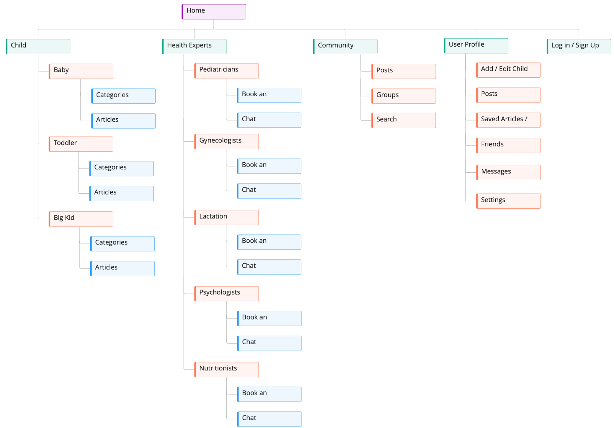
Information Architecture
I designed an intuitive information architecture for a parenting support platform, making it easy for parents to find resources, connect with experts, and engage with a community. The structure organizes content by child age, expert consultations, and user interactions, ensuring a smooth and supportive experience.
Design Phase
Paper Wireframes
I did a quick ideation exercise to come up with ideas for how to address gaps identified in the competitive audit.

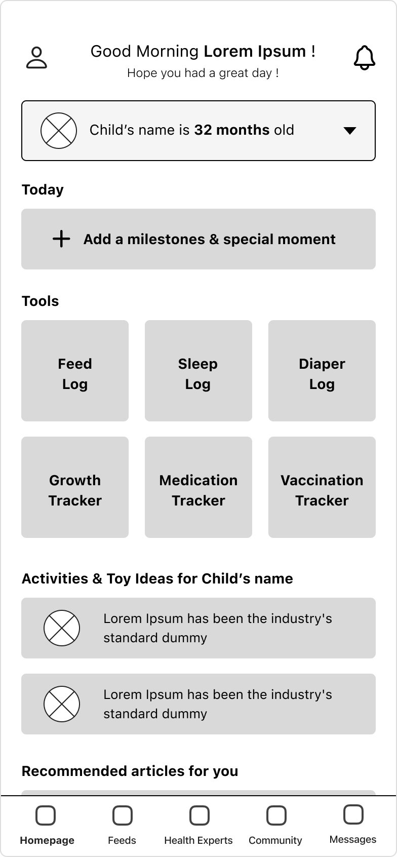
Low Fidelity Wireframes
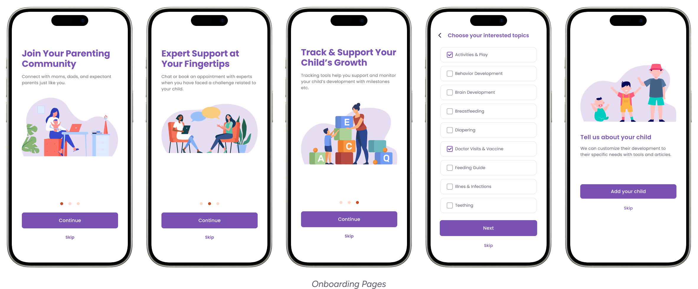
After ideating and drafting some paper wireframes, I created the initial designs for the new parenting app. These designs focus on showing articles based on users interested in topics, reaching out to health experts, and interacting with other users in community groups.
Test Phase
Usability Testing
I conducted an unmoderated usability study with 4 participants. Research goals are determining if users can complete core tasks and making sure the user flow is correct if the app has any pain points in the whole process of the task flow. These pain points below are items that users have determined.
Testing Method
- Participants: 4
- Testing Type: Moderated remote usability testing.
- Prototype Used: Figma interactive prototype.
Usability Findings
Some users need to browse the experts’ messages and the community users' messages separately.
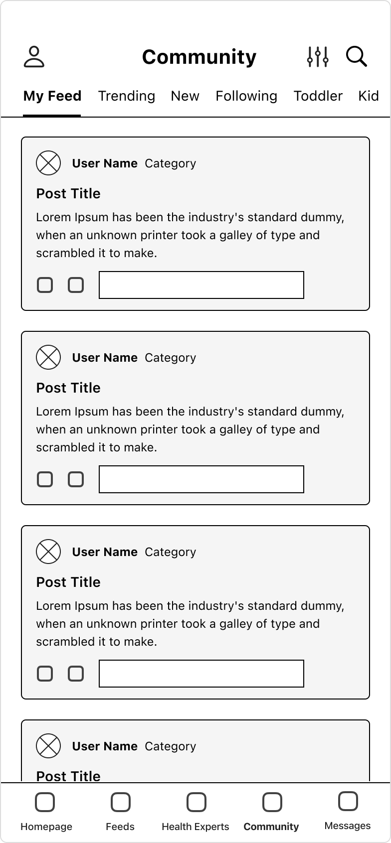
Most users need to join community groups that align with their interests and passions.
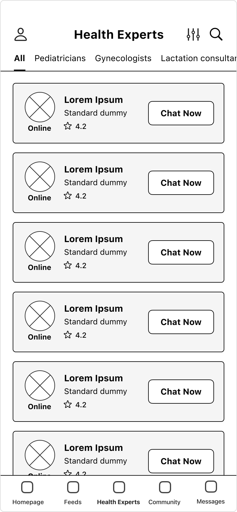
Some users need an appointment button on the health experts card on the list page.
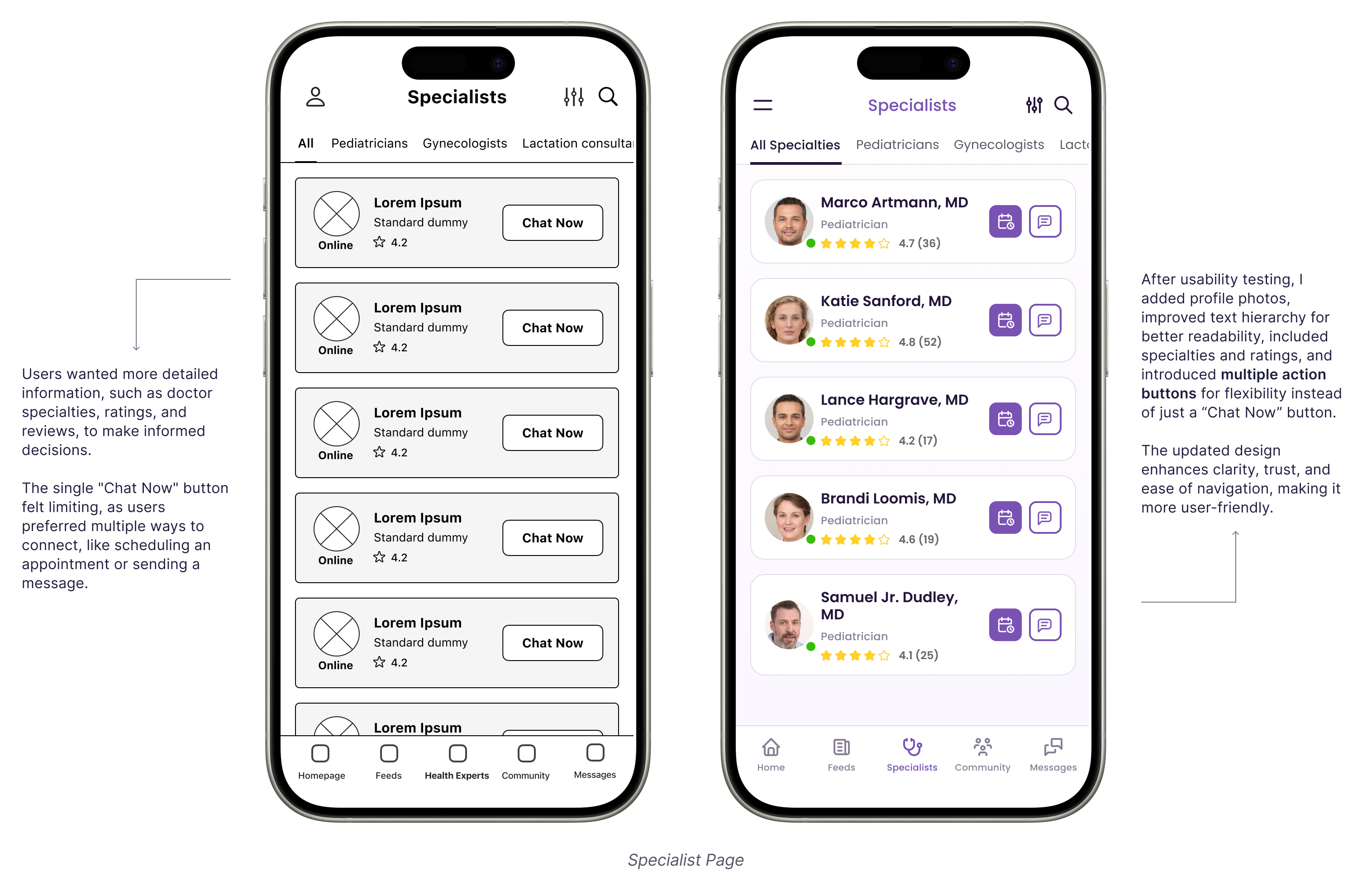
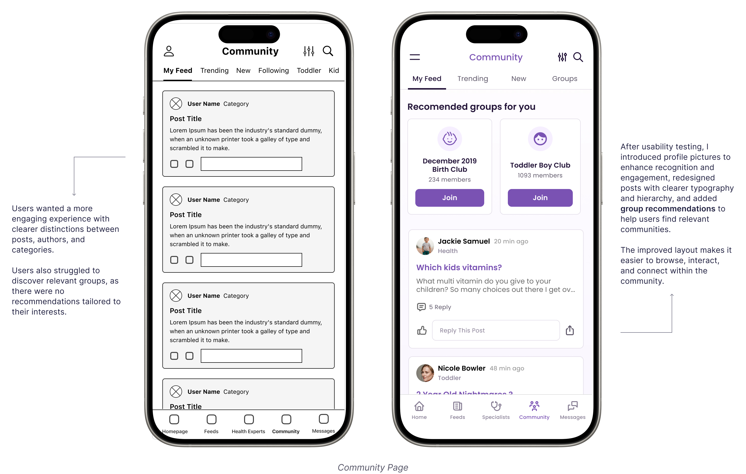
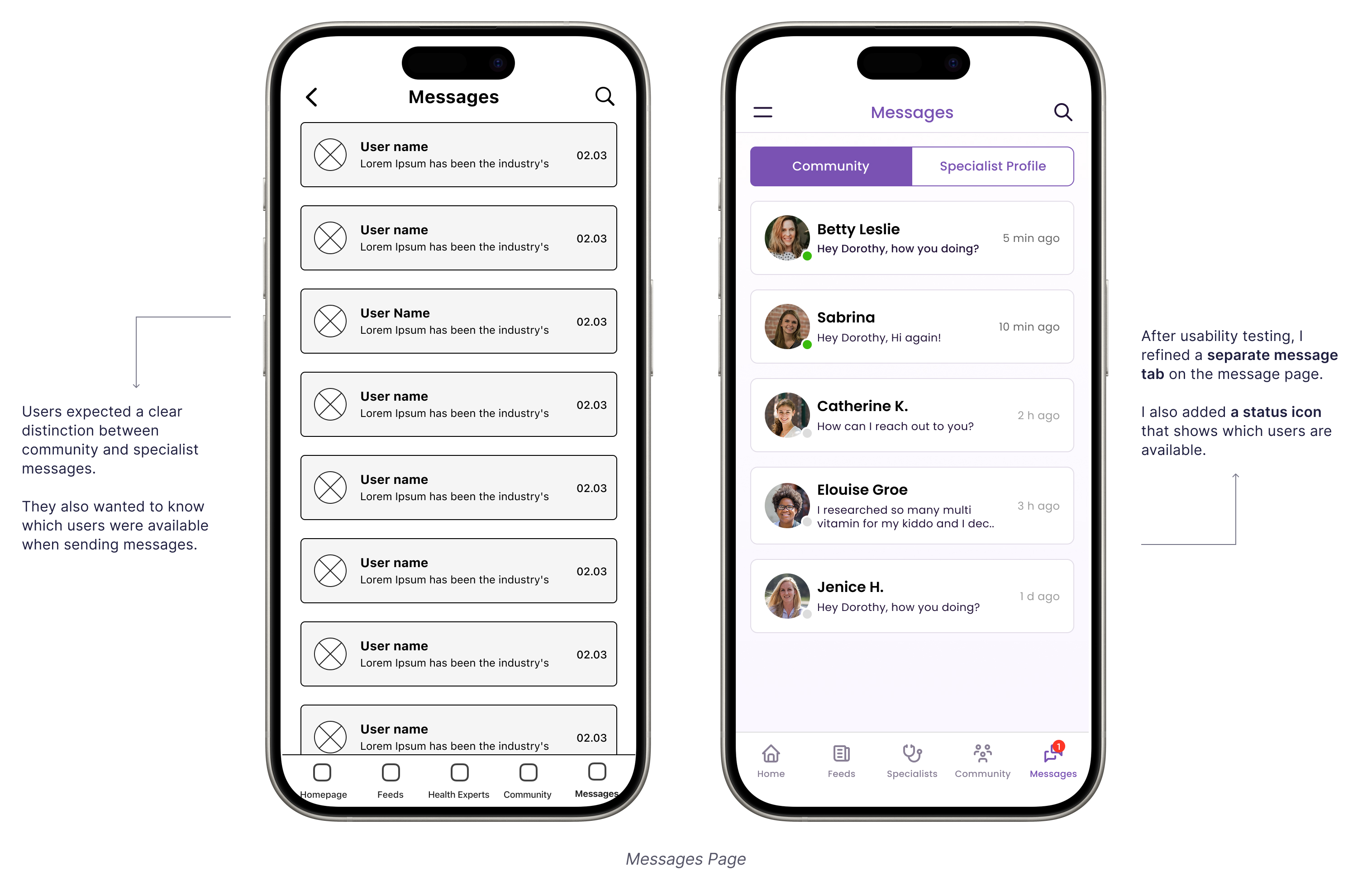
Refining The Visual Design
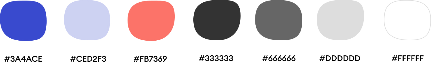
Design System
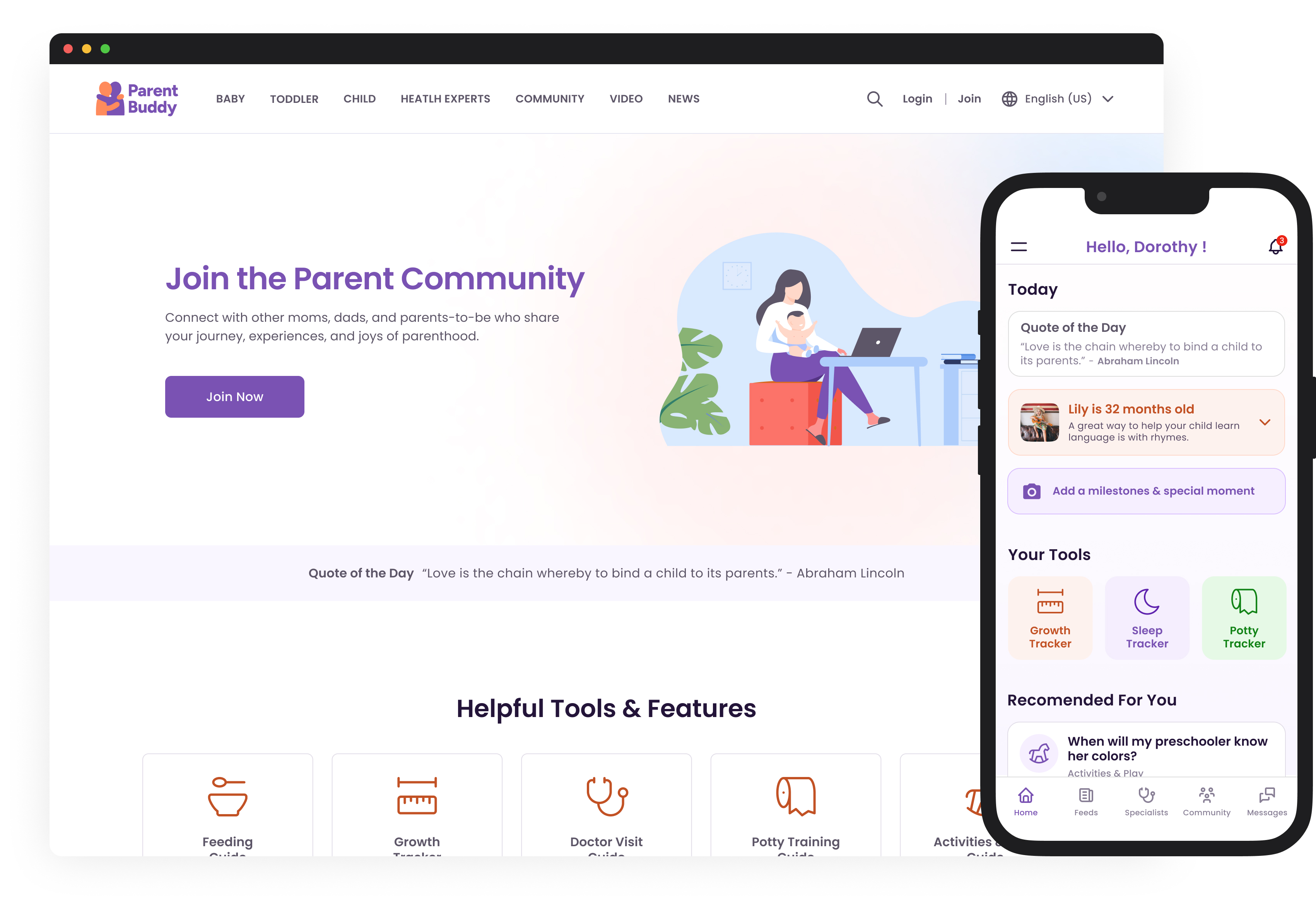
I designed a simple, cohesive system for ParentBuddy using the Poppins font for clarity and warmth. The color palette - deep purples, soft grays, and a warm orange accent—creates a calm, inviting feel. I built reusable components like navigation and tip cards to keep things consistent. With a focus on accessibility, I refined contrast, spacing, and text sizing to make it easy to use for everyone. My goal was to keep it intuitive, friendly, and effortless.
Typography

Colors
Icons
Components

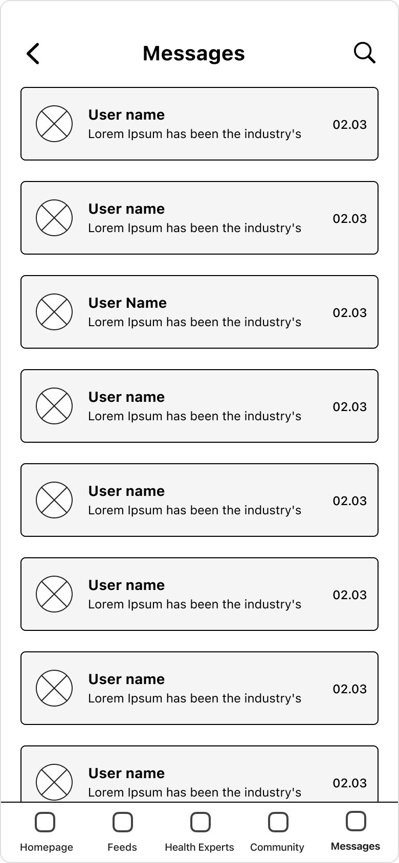
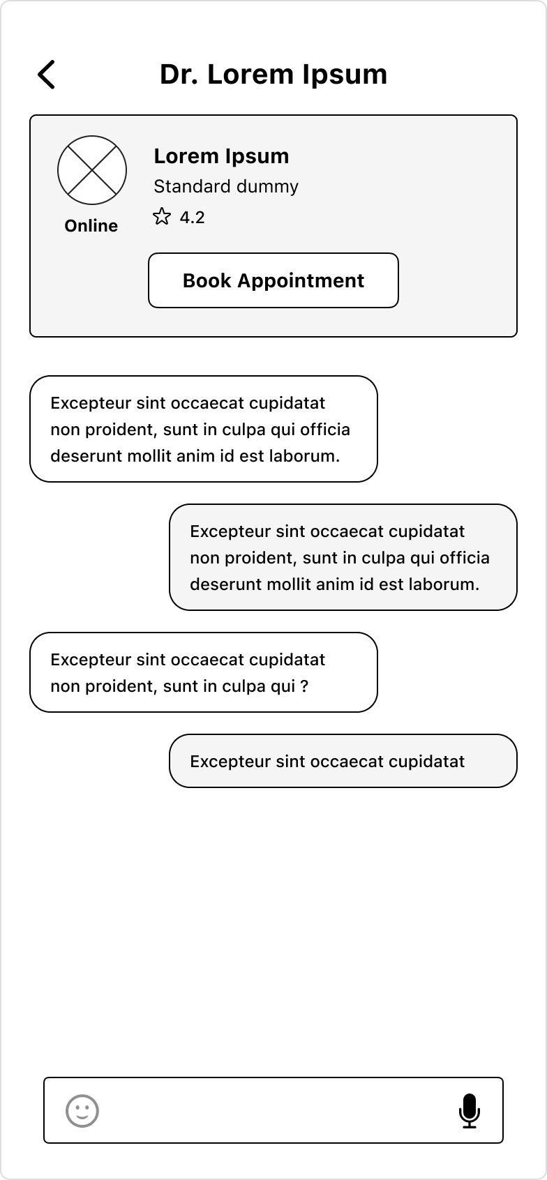
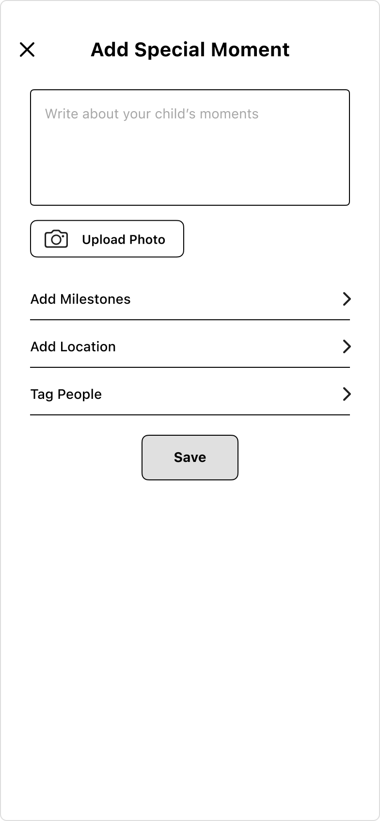
High Fidelity Mockups
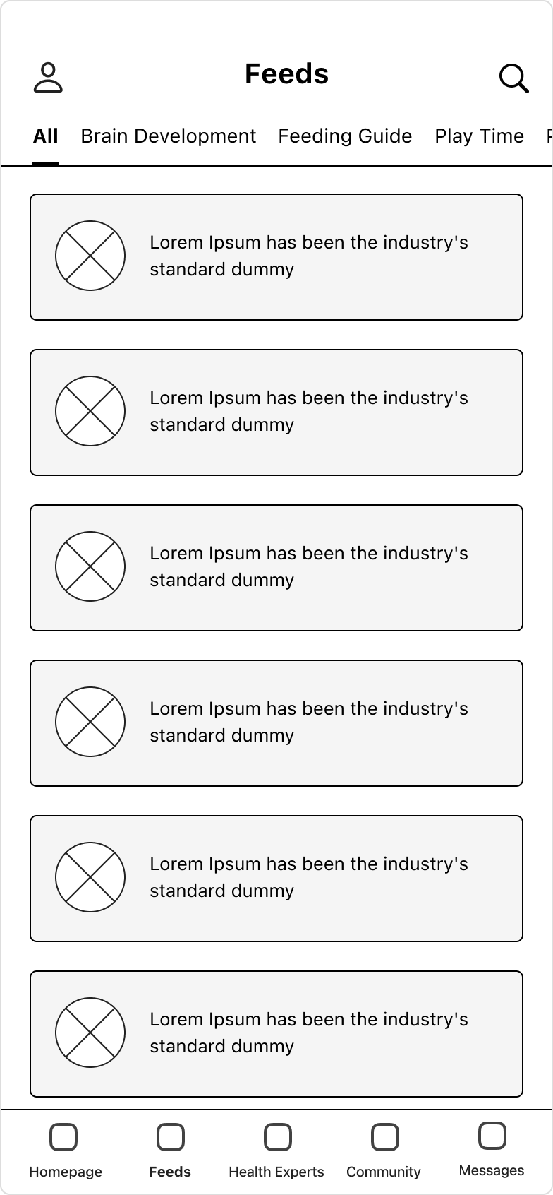
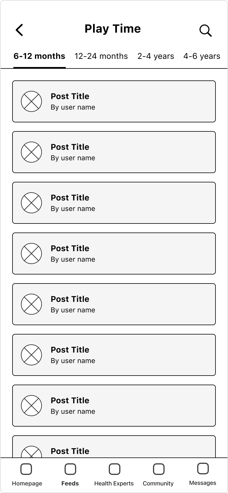
For this project, I designed 29 high-fidelity mockups to bring the app’s interface to life. I focused on details like typography, color schemes, and interactive elements to create a polished yet intuitive experience. There are some essential screens below.
Responsive Variations
Accessibility Considerations
The app follows WCAG guidelines, maintaining sufficient color contrast for readability.
Buttons and interactive elements have ample touch targets, making the app easy to use for individuals with motor impairments.
The font choices prioritize legibility, with scalable text sizes and adaptable line spacing to enhance readability for all users.
Going Forward
Takeaways & Next Steps
Designing ParentBuddy reinforced the importance of empathetic and intuitive design for busy parents managing their child’s activities and milestones. User research highlighted the need for simplicity, efficiency, and collaboration, shaping a clean, functional UI.
Moving forward, the next steps include usability testing, feature enhancements like AI-powered suggestions and milestone insights, accessibility improvements, and refining the prototype for a potential MVP launch. This project reinforced my passion for human-centered design and the impact thoughtful UX can have on real-life challenges.
High Fidelity Prototype
Other Projects